Raquel Leis Allion has been Art Director at the Folio Society for nearly four years. It’s her to job to commission illustrators and that means knowing each book inside out. Raquel also designs the bindings, as well as selecting the typography and materials for each edition. Here, she talks about the illustrator Kit Russell’s incredible designs for the
Folio edition of We.
Kit Russell is an award-winning illustrator and graphic designer whose illustrations are notable for their simple yet sophisticated graphic approach, inspired by his interest in visual illusions and pseudoscience.
For these reasons, Kit was the obvious choice to illustrate our edition of
We, Yevgeny Zamyatin’s dystopian novel.
A mathematical approach
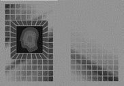
Kit’s interests in maths and playing with flat imagery means that he is able to transform 2D images and text into 3D objects. He constructs his ideas using lenticular imagery – something that changes its appearance when viewed at different angles. Images created through lenticular design can be made to morph from one object into another and these illustrations make up a large part of
Kit’s portfolio.
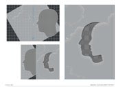
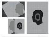
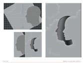
After discussing the brief, Kit came up with various designs for the binding, which you can see below.
Following a review and some further tweaks to his original ideas, Kit supplied the final designs for the binding and the book slipcase.
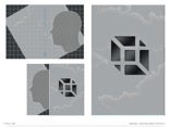
The lenticular process
A square was die-cut into the side of the slipcase and a printed acetate sheet was fixed behind it, creating a window. This design was a manufacturing challenge as there’s a risk that, when the book is transferred into and out of the slipcase, it might rub against the acetate. This could cause wear and tear on the binding image, result in the migration of ink onto the acetate or eventually cause the acetate to shift out of position.
To prevent any of these scenarios, we employed extra resources and handwork. A large acetate sheet was carefully inserted down one side of each slipcase, in between the layers of board to ensure it was absolutely secure. This also created ease of movement for the novelty mechanism.
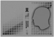
We used a pearlescent paper so that when the artwork was printed onto it, it not only looks gritty and industrial, but also emits a subtle glow that reflects the sense of awe in which one of the main characters, D-503, holds the One State.
Kit’s inspiration
Kit said his idea for the binding was, “derived from a personal project I worked on at University. Raquel had seen the project on my website and had the foresight to apply this to the traditional Folio slipcase. The lenticular mechanism of the binding/slipcase increases reader interaction whilst the illusionary effect produced perfectly mimics the central characters changing mental state. The mathematical and regulated nature seemed fitting for the book. It’s a really simple idea but I think it’s quite effective.”
[video width="1080" height="1080" mp4="/media/blog/2018/04/WYZ.mp4"][/video]
Find out more and order the Folio edition of We.