This Folio Life: Using beautiful typography to chart A History of Christianity
Creating a successful book cover or binding design presents different challenges for each edition. When faced with a monumental book like Diarmaid MacCulloch’s A History of Christianity, the question was how to represent such a vast stretch of time, over a vast area of the globe. From editor to picture researcher to art director, the team here explain how they solved this particular tricky task.
Starting with the picture research
By Non-Fiction Publisher by Mandy Kirkby
The subtitle of the book is ‘The First Three Thousand Years’ – so a theme was needed that would span three millennia. The cross was of course the natural and perfect choice, and this theme as well as the types of cross depicted were suggested to me by Folio picture researcher Rowena Anketell.
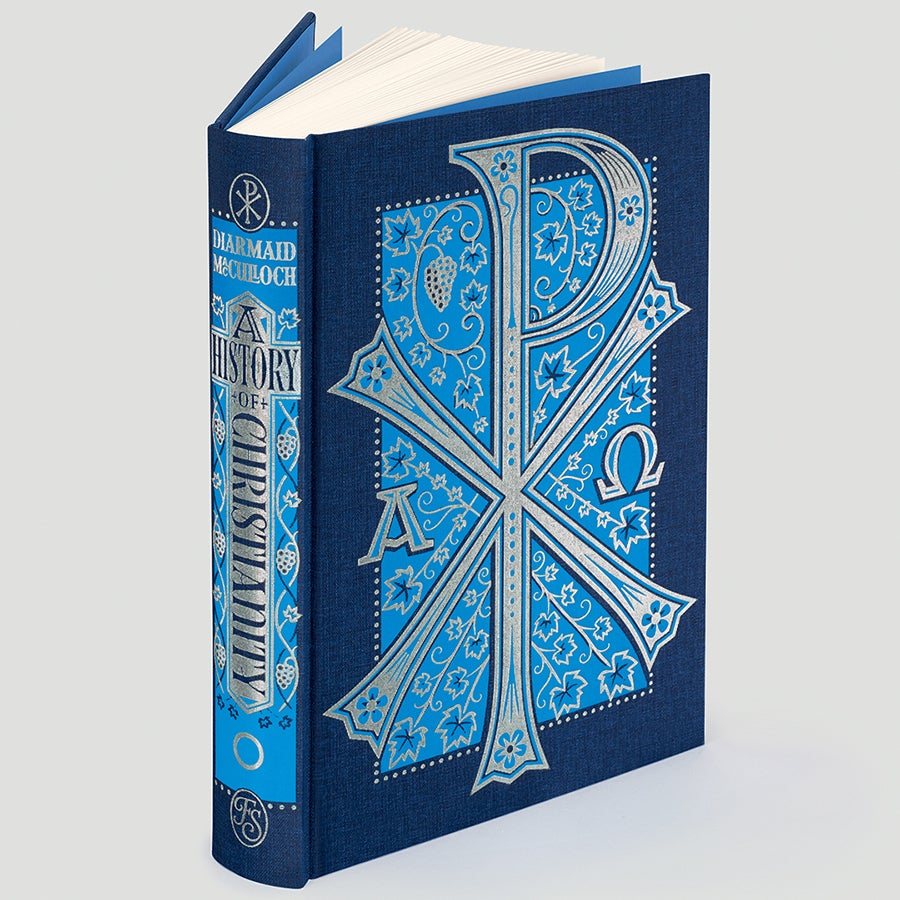
The first volume depicts a Chi Rho, an early Christian symbol, here combined with Alpha and Omega glyphs. The Chi Rho is not quite a cross, rather a christogram, a combination of letters that makes an abbreviated form of the name of Jesus Christ.
The second cover features a double-arm reliquary cross, based on an original from the 13th century. Often quite ornate, these hollow crosses contained holy relics.
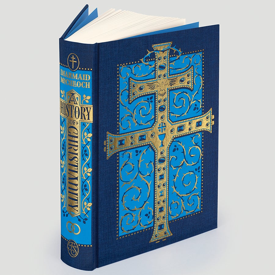
And the third binding represents the Church’s worldwide expansion and is inspired by a modern bronze Ethiopian processional cross.
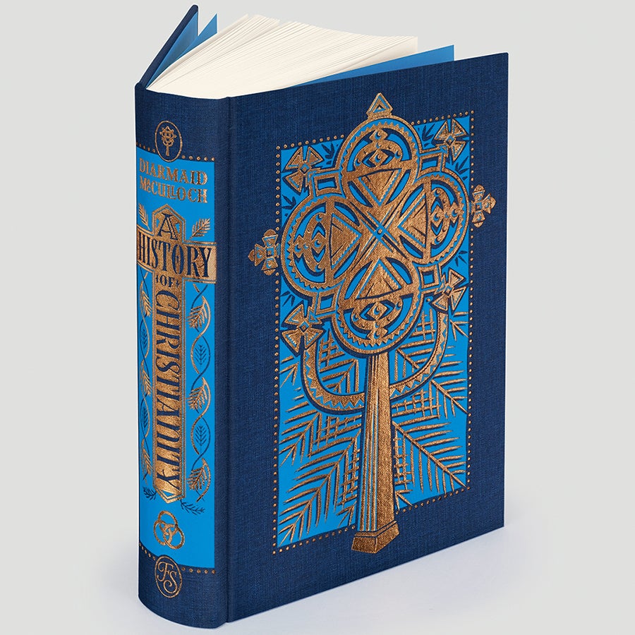
I discussed the idea with the Art Director on this project, Sheri Gee, to see what she would make of it.
Deciding on a concept
By Art Director Sheri Gee
It is really helpful to gain insight from the wider Folio team, including the editor and picture researcher, when starting to think of concepts for cover designs. They will have already immersed themselves in the text before I arrive at it, and the picture researcher may have supplied an initial selection of images which might influence the path I decide to take. In this instance, Mandy and I talked about Rowena’s concept and thought it would work very well visually.
I decided to look at Jamie Clarke’s work, wanting someone who could combine elegant design with hand-lettered type. I hadn’t worked with Jamie before but was impressed by his entry to our Book Illustration Competition back in 2014 for The Folio Book of Ghost Stories (for which he was a finalist) and I had followed his career since. Jamie clearly has a conceptual mind – his entries were quite beautiful and typographical, not what we were expecting at all.
Creating the artistic design
When Sheri contacted me about designing the covers for the three-volume edition of Diarmaid MacCulloch’s A History of Christianity, I jumped at the chance.
I love finding ways for a design to communicate of different levels. I really enjoy looking for ways to insert visual clues in both the composition and decoration that reinforce or augment the overall concept.
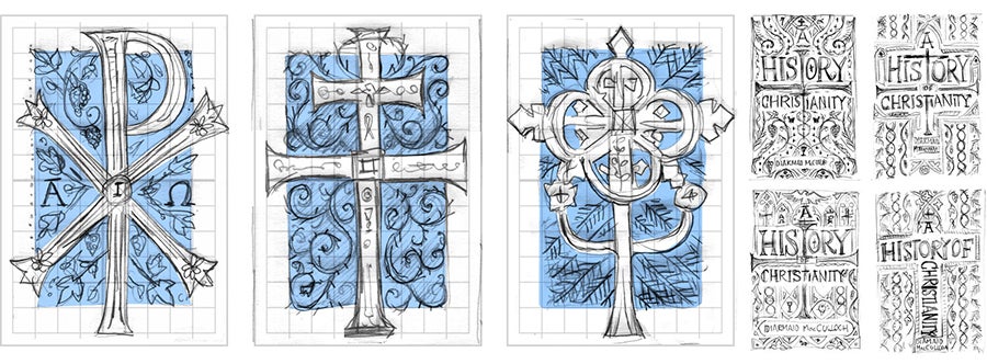
I imagined the crosses as large, decorative letters that were different but shared the same visual style, like characters in a font. I felt on very familiar ground.
While each cross is stylistically very distinct, I drew them with similar proportions and a shared symmetry to balance them as a set. Around each cross I wove a pattern of vines, thorny brambles and palm leaves – three key Christian symbols –that were then echoed on the spines and the slipcase design.
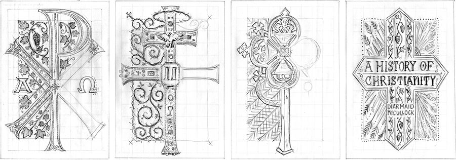
This overall style pays a small homage to the beautiful decorated bindings of Margaret Neilson Armstrong (1867–1944), an American designer working in the Art Nouveau style whose exquisite covers favoured natural forms, usually plant motifs.
The three covers are fully bound in cloth, with blocking in two colours on the front of each. We decided that the set of crosses were strong enough for us to use a different metallic foil on each volume – silver, gold and bronze – each being most appropriate to the crosses from which I took reference.
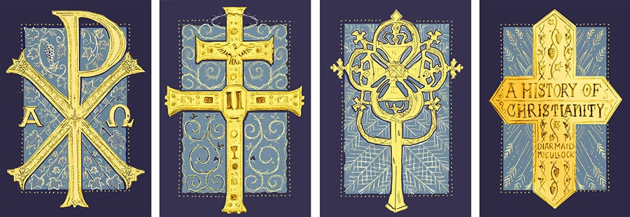
To ensure there was visual cohesion across the covers I created a grid that each cross could be mapped on to and this grid was then also used to align the elements on the spine and slipcase.
