
The Weight of War and Peace
For readers, War and Peace is a considerable undertaking – over 1,500 pages and 500 characters to follow, and a sprawling narrative spanning multiple families and political regimes. For illustrators, as Igor Karash (who illustrated Folio's recent two-volume edition) explains below, the challenge is equally daunting – how to remain respectful to previous, iconic representations of the novel in art and on film, and create something original and personal to the artist.
Several years have now passed since I started work on my series of illustrations for Folio Society’s edition of War and Peace. Only now am I able to reflect on my intentions and the roots of my vision and process. But where should I begin? My memory takes me to a time when I, like every other school boy and girl in the Soviet Union, studied War and Peace as part of our Russian literature program. The Great Patriotic War of 1812 was also taught in our history class.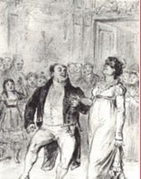
 [caption id="attachment_6615" align="aligncenter" width="136"]
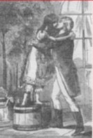 Mikhail Bashilov illustrations for the first edition of War & Peace[/caption]
To be truthful, although assigned for the summer break in ‘76, I did not invest much time reading the heaviest and most sacred book we had standing on the bookshelves of my family’s tiny Soviet flat in Baku. I had better things to do – play bass guitar with my bandmates, and listen to Led Zeppelin's Physical Graffiti album which had just arrived on our shores. My reading list at the time consisted mostly of Stanislaw Lem’s science fiction, Ray Bradbury, and xeroxed copies of Mikhail Bulgakov’s banned works. A few weeks before my final year in high school began, I browsed swiftly through the major episodes of the book, forgoing the boring (for my taste at the time) descriptions of what seemed like every battle ever between the French and the Russians.
But there was another side to my education – or I would say to my ‘artistic development’ – which were the many inspiring hours I spent with my uncle at his home design studio in Baku Old City (Icheri Shekher). Busy with my unskillful drawing and painting experiments, I would dig through all the books in my uncle’s art library. Most of the rare books were kept in a small mezzanine above the corridor – and that is where I saw some of the most incredible books including various illustrated editions of War and Peace.
Mikhail Bashilov illustrations for the first edition of War & Peace[/caption]
To be truthful, although assigned for the summer break in ‘76, I did not invest much time reading the heaviest and most sacred book we had standing on the bookshelves of my family’s tiny Soviet flat in Baku. I had better things to do – play bass guitar with my bandmates, and listen to Led Zeppelin's Physical Graffiti album which had just arrived on our shores. My reading list at the time consisted mostly of Stanislaw Lem’s science fiction, Ray Bradbury, and xeroxed copies of Mikhail Bulgakov’s banned works. A few weeks before my final year in high school began, I browsed swiftly through the major episodes of the book, forgoing the boring (for my taste at the time) descriptions of what seemed like every battle ever between the French and the Russians.
But there was another side to my education – or I would say to my ‘artistic development’ – which were the many inspiring hours I spent with my uncle at his home design studio in Baku Old City (Icheri Shekher). Busy with my unskillful drawing and painting experiments, I would dig through all the books in my uncle’s art library. Most of the rare books were kept in a small mezzanine above the corridor – and that is where I saw some of the most incredible books including various illustrated editions of War and Peace.

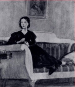
 [caption id="attachment_6619" align="aligncenter" width="177"]
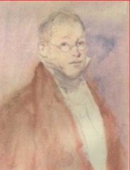
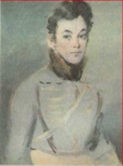 The pale watercolours of Konstantin Rudakov[/caption]
I remember the romantic and intimate pale watercolors by Konstantin Rudakov, beautifully printed on creamy paper in contrast to the dark, energetic, and psychologically loaded charcoals of Dmitri Shmarinov.
The pale watercolours of Konstantin Rudakov[/caption]
I remember the romantic and intimate pale watercolors by Konstantin Rudakov, beautifully printed on creamy paper in contrast to the dark, energetic, and psychologically loaded charcoals of Dmitri Shmarinov.
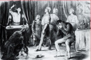
 [caption id="attachment_6622" align="aligncenter" width="242"]
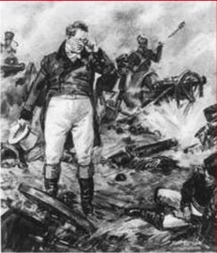 The psychologically loaded charcoals of Dmitri Shmarinov[/caption]
There was also the pompous and overly decorative illustrations of Ivan Sytin (one of the most prominent book publishers in pre-revolutionary Russia) for the 1912 edition of the book, published to commemorate the 100 year anniversary of the victory over Napoleon.
The psychologically loaded charcoals of Dmitri Shmarinov[/caption]
There was also the pompous and overly decorative illustrations of Ivan Sytin (one of the most prominent book publishers in pre-revolutionary Russia) for the 1912 edition of the book, published to commemorate the 100 year anniversary of the victory over Napoleon.
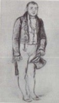
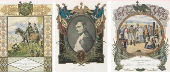 [caption id="attachment_6624" align="aligncenter" width="186"]
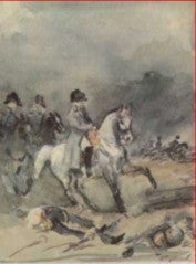
 Some of Ivan Sytin's illustrations for the 1912 edition of War and Peace[/caption]
Another bright spot in my early experiences with War and Peace was one of the greatest cinematographic adaptations of the book released in the Soviet Union in the late 1960s. The Soviet Politburo couldn’t sleep knowing that the most ambitious adaptation of Tolstoy’s novel had been filmed in the United States (directed by King Vidor in 1956). It was decided that it was time for a new version and that it should be directed by Sergey Bondarchuk. Bondarchuk was the most recognizable film director on the Soviet cinematographic scene at that time, and his version became one of the most expansive and perhaps most expensive films in Soviet film history and received an Oscar in the foreign film category.
[caption id="attachment_6625" align="alignright" width="355"]
Some of Ivan Sytin's illustrations for the 1912 edition of War and Peace[/caption]
Another bright spot in my early experiences with War and Peace was one of the greatest cinematographic adaptations of the book released in the Soviet Union in the late 1960s. The Soviet Politburo couldn’t sleep knowing that the most ambitious adaptation of Tolstoy’s novel had been filmed in the United States (directed by King Vidor in 1956). It was decided that it was time for a new version and that it should be directed by Sergey Bondarchuk. Bondarchuk was the most recognizable film director on the Soviet cinematographic scene at that time, and his version became one of the most expansive and perhaps most expensive films in Soviet film history and received an Oscar in the foreign film category.
[caption id="attachment_6625" align="alignright" width="355"]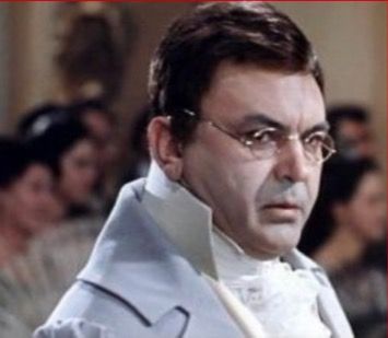 Sergey Bondarchuk as Pierre[/caption]
Despite some of the controversies, like the number of horses killed during production and Sergey Bondarchuk’s age in playing the role of Pierre Bezukhov, he masterfully focused on portraying the characters' inner world and development. Bondarchuk’s vision preoccupied our psyche for many years to come, given that we had no access to any foreign film adaptations.
And now we are back to 2013. With a brave face and quite a heavy heart filled with doubts about my fit for such an ambitious project, I said yes to a once-in-a-lifetime opportunity to illustrate one of the most historically important books, for one of the most prominent publishers that continues to invest in the art of book illustration.
Sergey Bondarchuk as Pierre[/caption]
Despite some of the controversies, like the number of horses killed during production and Sergey Bondarchuk’s age in playing the role of Pierre Bezukhov, he masterfully focused on portraying the characters' inner world and development. Bondarchuk’s vision preoccupied our psyche for many years to come, given that we had no access to any foreign film adaptations.
And now we are back to 2013. With a brave face and quite a heavy heart filled with doubts about my fit for such an ambitious project, I said yes to a once-in-a-lifetime opportunity to illustrate one of the most historically important books, for one of the most prominent publishers that continues to invest in the art of book illustration.
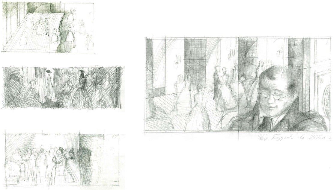
I always begin each project by producing a visual concept, which would normally include inspirational images, some writing, and a series of sketches. This time my formal concept, entitled 'Order and Destruction', was about the collision between aristocratic norms and values, represented by neo-classical art forms, and the chaotic and unpredictable winds of history, which in my mind could be represented in painting by borrowing visual language from the Russian avant-garde. [caption id="attachment_6627" align="aligncenter" width="498"]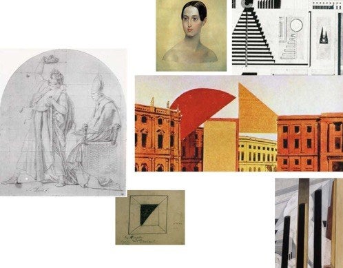 Igor Karash's proposal document for War and Peace[/caption]
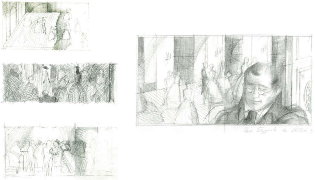
While filling up my digital space and the physical space of my living room studio with hundreds of images and books, I finally began reading the book. The immediate task was to identify the most important and inspiring scenes to illustrate.
By the time I was half-way through the book making notes and marking pages, so many things I wasn’t able to comprehend and feel deeply in my youth came to me as mind-blowing revelations. The metaphor of a river of life quickly emerged as the clearest way to understand the book – a river flowing from a peaceful source until its waters become wild and unpredictable and filled with an energy that is both positive and destructive.
Igor Karash's proposal document for War and Peace[/caption]
While filling up my digital space and the physical space of my living room studio with hundreds of images and books, I finally began reading the book. The immediate task was to identify the most important and inspiring scenes to illustrate.
By the time I was half-way through the book making notes and marking pages, so many things I wasn’t able to comprehend and feel deeply in my youth came to me as mind-blowing revelations. The metaphor of a river of life quickly emerged as the clearest way to understand the book – a river flowing from a peaceful source until its waters become wild and unpredictable and filled with an energy that is both positive and destructive.
 [caption id="attachment_6630" align="aligncenter" width="700"]
 More of Igor Karash's exploratory sketches for War and Peace[/caption]
The deeper I dove into the waters of Tolstoy’s writing, the more the poetic and philosophical meanings of the book opened up to me in a symphonic way. Tolstoy’s masterful examination of the characters’ evolution in the midst of dramatic historical shifts, and the many nuances of life’s mystical, political, social and religious aspects, and the grotesque scenery echoed Tolstoy’s interest in fate and psychology as evident in the philosophical essays woven into the text. These nuances have been largely overlooked by the many artists who have illustrated the text previously.
I turned my attention to ‘listening’ to this symphony and attempted to translate it in a manner that highlighted the subtle nuances. I stopped referring to the numerous visual representations of the book and limited myself only to visual materials which helped me with historical accuracy. This was the only way to rid myself of the visual burden which had preoccupied my mind and for me to develop an independent vision.
[caption id="attachment_6631" align="aligncenter" width="700"]
More of Igor Karash's exploratory sketches for War and Peace[/caption]
The deeper I dove into the waters of Tolstoy’s writing, the more the poetic and philosophical meanings of the book opened up to me in a symphonic way. Tolstoy’s masterful examination of the characters’ evolution in the midst of dramatic historical shifts, and the many nuances of life’s mystical, political, social and religious aspects, and the grotesque scenery echoed Tolstoy’s interest in fate and psychology as evident in the philosophical essays woven into the text. These nuances have been largely overlooked by the many artists who have illustrated the text previously.
I turned my attention to ‘listening’ to this symphony and attempted to translate it in a manner that highlighted the subtle nuances. I stopped referring to the numerous visual representations of the book and limited myself only to visual materials which helped me with historical accuracy. This was the only way to rid myself of the visual burden which had preoccupied my mind and for me to develop an independent vision.
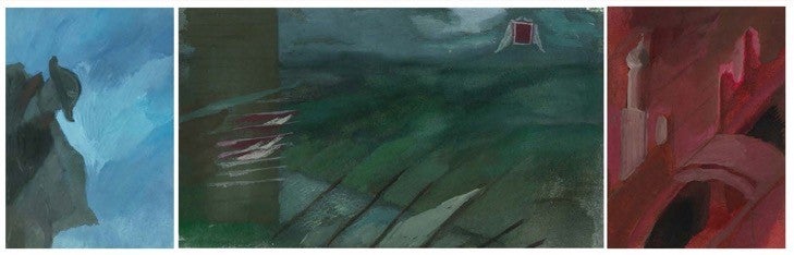
[caption id="attachment_6631" align="aligncenter" width="700"]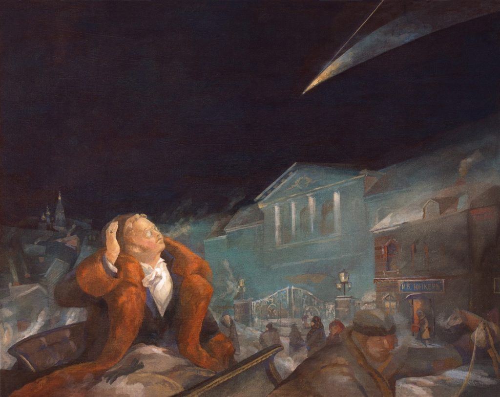 'It seemed to Pierre that this star answered fully to what was in his softened and encouraged soul, now blossoming into new life.' One of Igor Karash's illustrations from War and Peace[/caption]
'It seemed to Pierre that this star answered fully to what was in his softened and encouraged soul, now blossoming into new life.' One of Igor Karash's illustrations from War and Peace
Although my series of illustrations is developed around particular scenes (of course there are a number of notable scenes that capture the imagination that could not be ignored), I paid much attention to create a few novel threads within my series – one that is rooted in reality and another related to dreams, aspirations, memories and thoughts.
Strategic illustration placement and layout along with symbolic color use, and compositions using geometric elements, allowed me to direct the visual narrative in a new yet still recognizable direction.
[caption id="attachment_6632" align="aligncenter" width="700"]
'It seemed to Pierre that this star answered fully to what was in his softened and encouraged soul, now blossoming into new life.' One of Igor Karash's illustrations from War and Peace[/caption]
'It seemed to Pierre that this star answered fully to what was in his softened and encouraged soul, now blossoming into new life.' One of Igor Karash's illustrations from War and Peace
Although my series of illustrations is developed around particular scenes (of course there are a number of notable scenes that capture the imagination that could not be ignored), I paid much attention to create a few novel threads within my series – one that is rooted in reality and another related to dreams, aspirations, memories and thoughts.
Strategic illustration placement and layout along with symbolic color use, and compositions using geometric elements, allowed me to direct the visual narrative in a new yet still recognizable direction.
[caption id="attachment_6632" align="aligncenter" width="700"] 'Ahead was glory ...' Another of Igor Karash's illustrations from War and Peace[/caption]
Illustrating War and Peace was the most involved illustration project I have completed. Following the difficult beginning stages I was able to shed the weight of all the imagery and cinematic representations which have come before, and with the support and trust of the Folio team, to find calmer waters.
I hope this Folio edition of War and Peace inspires you to find time in your busy schedule to reacquaint yourself with this magnificent book.
-- Igor Karash, February 2016
'Ahead was glory ...' Another of Igor Karash's illustrations from War and Peace[/caption]
Illustrating War and Peace was the most involved illustration project I have completed. Following the difficult beginning stages I was able to shed the weight of all the imagery and cinematic representations which have come before, and with the support and trust of the Folio team, to find calmer waters.
I hope this Folio edition of War and Peace inspires you to find time in your busy schedule to reacquaint yourself with this magnificent book.
-- Igor Karash, February 2016
Several years have now passed since I started work on my series of illustrations for Folio Society’s edition of War and Peace. Only now am I able to reflect on my intentions and the roots of my vision and process. But where should I begin? My memory takes me to a time when I, like every other school boy and girl in the Soviet Union, studied War and Peace as part of our Russian literature program. The Great Patriotic War of 1812 was also taught in our history class.
[caption id="attachment_6615" align="aligncenter" width="136"] Mikhail Bashilov illustrations for the first edition of War & Peace[/caption]
To be truthful, although assigned for the summer break in ‘76, I did not invest much time reading the heaviest and most sacred book we had standing on the bookshelves of my family’s tiny Soviet flat in Baku. I had better things to do – play bass guitar with my bandmates, and listen to Led Zeppelin's Physical Graffiti album which had just arrived on our shores. My reading list at the time consisted mostly of Stanislaw Lem’s science fiction, Ray Bradbury, and xeroxed copies of Mikhail Bulgakov’s banned works. A few weeks before my final year in high school began, I browsed swiftly through the major episodes of the book, forgoing the boring (for my taste at the time) descriptions of what seemed like every battle ever between the French and the Russians.
But there was another side to my education – or I would say to my ‘artistic development’ – which were the many inspiring hours I spent with my uncle at his home design studio in Baku Old City (Icheri Shekher). Busy with my unskillful drawing and painting experiments, I would dig through all the books in my uncle’s art library. Most of the rare books were kept in a small mezzanine above the corridor – and that is where I saw some of the most incredible books including various illustrated editions of War and Peace.
[caption id="attachment_6619" align="aligncenter" width="177"] The pale watercolours of Konstantin Rudakov[/caption]
I remember the romantic and intimate pale watercolors by Konstantin Rudakov, beautifully printed on creamy paper in contrast to the dark, energetic, and psychologically loaded charcoals of Dmitri Shmarinov.
[caption id="attachment_6622" align="aligncenter" width="242"] The psychologically loaded charcoals of Dmitri Shmarinov[/caption]
There was also the pompous and overly decorative illustrations of Ivan Sytin (one of the most prominent book publishers in pre-revolutionary Russia) for the 1912 edition of the book, published to commemorate the 100 year anniversary of the victory over Napoleon.
[caption id="attachment_6624" align="aligncenter" width="186"] Some of Ivan Sytin's illustrations for the 1912 edition of War and Peace[/caption]
Another bright spot in my early experiences with War and Peace was one of the greatest cinematographic adaptations of the book released in the Soviet Union in the late 1960s. The Soviet Politburo couldn’t sleep knowing that the most ambitious adaptation of Tolstoy’s novel had been filmed in the United States (directed by King Vidor in 1956). It was decided that it was time for a new version and that it should be directed by Sergey Bondarchuk. Bondarchuk was the most recognizable film director on the Soviet cinematographic scene at that time, and his version became one of the most expansive and perhaps most expensive films in Soviet film history and received an Oscar in the foreign film category.
[caption id="attachment_6625" align="alignright" width="355"] Sergey Bondarchuk as Pierre[/caption]
Despite some of the controversies, like the number of horses killed during production and Sergey Bondarchuk’s age in playing the role of Pierre Bezukhov, he masterfully focused on portraying the characters' inner world and development. Bondarchuk’s vision preoccupied our psyche for many years to come, given that we had no access to any foreign film adaptations.
And now we are back to 2013. With a brave face and quite a heavy heart filled with doubts about my fit for such an ambitious project, I said yes to a once-in-a-lifetime opportunity to illustrate one of the most historically important books, for one of the most prominent publishers that continues to invest in the art of book illustration.
I always begin each project by producing a visual concept, which would normally include inspirational images, some writing, and a series of sketches. This time my formal concept, entitled 'Order and Destruction', was about the collision between aristocratic norms and values, represented by neo-classical art forms, and the chaotic and unpredictable winds of history, which in my mind could be represented in painting by borrowing visual language from the Russian avant-garde. [caption id="attachment_6627" align="aligncenter" width="498"]
Igor Karash's proposal document for War and Peace[/caption]
While filling up my digital space and the physical space of my living room studio with hundreds of images and books, I finally began reading the book. The immediate task was to identify the most important and inspiring scenes to illustrate.
By the time I was half-way through the book making notes and marking pages, so many things I wasn’t able to comprehend and feel deeply in my youth came to me as mind-blowing revelations. The metaphor of a river of life quickly emerged as the clearest way to understand the book – a river flowing from a peaceful source until its waters become wild and unpredictable and filled with an energy that is both positive and destructive.
 [caption id="attachment_6630" align="aligncenter" width="700"]
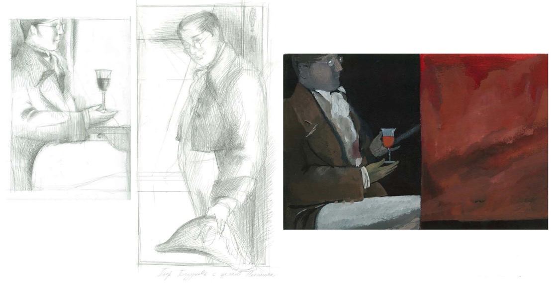 More of Igor Karash's exploratory sketches for War and Peace[/caption]
The deeper I dove into the waters of Tolstoy’s writing, the more the poetic and philosophical meanings of the book opened up to me in a symphonic way. Tolstoy’s masterful examination of the characters’ evolution in the midst of dramatic historical shifts, and the many nuances of life’s mystical, political, social and religious aspects, and the grotesque scenery echoed Tolstoy’s interest in fate and psychology as evident in the philosophical essays woven into the text. These nuances have been largely overlooked by the many artists who have illustrated the text previously.
I turned my attention to ‘listening’ to this symphony and attempted to translate it in a manner that highlighted the subtle nuances. I stopped referring to the numerous visual representations of the book and limited myself only to visual materials which helped me with historical accuracy. This was the only way to rid myself of the visual burden which had preoccupied my mind and for me to develop an independent vision.
[caption id="attachment_6631" align="aligncenter" width="700"]
More of Igor Karash's exploratory sketches for War and Peace[/caption]
The deeper I dove into the waters of Tolstoy’s writing, the more the poetic and philosophical meanings of the book opened up to me in a symphonic way. Tolstoy’s masterful examination of the characters’ evolution in the midst of dramatic historical shifts, and the many nuances of life’s mystical, political, social and religious aspects, and the grotesque scenery echoed Tolstoy’s interest in fate and psychology as evident in the philosophical essays woven into the text. These nuances have been largely overlooked by the many artists who have illustrated the text previously.
I turned my attention to ‘listening’ to this symphony and attempted to translate it in a manner that highlighted the subtle nuances. I stopped referring to the numerous visual representations of the book and limited myself only to visual materials which helped me with historical accuracy. This was the only way to rid myself of the visual burden which had preoccupied my mind and for me to develop an independent vision.
[caption id="attachment_6631" align="aligncenter" width="700"] 'It seemed to Pierre that this star answered fully to what was in his softened and encouraged soul, now blossoming into new life.' One of Igor Karash's illustrations from War and Peace[/caption]
'It seemed to Pierre that this star answered fully to what was in his softened and encouraged soul, now blossoming into new life.' One of Igor Karash's illustrations from War and Peace
Although my series of illustrations is developed around particular scenes (of course there are a number of notable scenes that capture the imagination that could not be ignored), I paid much attention to create a few novel threads within my series – one that is rooted in reality and another related to dreams, aspirations, memories and thoughts.
Strategic illustration placement and layout along with symbolic color use, and compositions using geometric elements, allowed me to direct the visual narrative in a new yet still recognizable direction.
[caption id="attachment_6632" align="aligncenter" width="700"]
'It seemed to Pierre that this star answered fully to what was in his softened and encouraged soul, now blossoming into new life.' One of Igor Karash's illustrations from War and Peace[/caption]
'It seemed to Pierre that this star answered fully to what was in his softened and encouraged soul, now blossoming into new life.' One of Igor Karash's illustrations from War and Peace
Although my series of illustrations is developed around particular scenes (of course there are a number of notable scenes that capture the imagination that could not be ignored), I paid much attention to create a few novel threads within my series – one that is rooted in reality and another related to dreams, aspirations, memories and thoughts.
Strategic illustration placement and layout along with symbolic color use, and compositions using geometric elements, allowed me to direct the visual narrative in a new yet still recognizable direction.
[caption id="attachment_6632" align="aligncenter" width="700"] 'Ahead was glory ...' Another of Igor Karash's illustrations from War and Peace[/caption]
Illustrating War and Peace was the most involved illustration project I have completed. Following the difficult beginning stages I was able to shed the weight of all the imagery and cinematic representations which have come before, and with the support and trust of the Folio team, to find calmer waters.
I hope this Folio edition of War and Peace inspires you to find time in your busy schedule to reacquaint yourself with this magnificent book.
-- Igor Karash, February 2016
'Ahead was glory ...' Another of Igor Karash's illustrations from War and Peace[/caption]
Illustrating War and Peace was the most involved illustration project I have completed. Following the difficult beginning stages I was able to shed the weight of all the imagery and cinematic representations which have come before, and with the support and trust of the Folio team, to find calmer waters.
I hope this Folio edition of War and Peace inspires you to find time in your busy schedule to reacquaint yourself with this magnificent book.
-- Igor Karash, February 2016