Illustrating Shakespeare
Neil Packer illustrated Shakespeare’s The Complete Plays for the new Folio limited edition, published to celebrate the 400th anniversary of the First Folio. In this fascinating blog, Packer selects three of his favourite illustrations and reveals how he transformed his ideas to the page.
Finding an Image
My primary task as an illustrator is to give a visual identity to a book. This is not exclusively my role as it is a collaboration between the illustrator, the art director, the production designer and the typesetter as well as the editor, and requires everyone to have a sense of where we need to take a design. Lengthy discussions about an approach will take place before work even begins on a design, as everyone must be in agreement about the direction. There are many factors in play such as budget, a timetable, and who we might want a book to appeal to, but above all else is the idea that we must serve the text and how visually this can best be achieved.
Our first consideration in designing this edition was that it should be a suitable celebration of the First Folio from 1623, and that stylistically this needed to be at least the starting point for our design – an edition that paid homage to and respected that of 400 years ago but which wasn’t a facsimile and felt modern, or, perhaps more importantly, timeless. So, my first question upon starting to think about the illustrations for this book was this: ‘Had the 1623 edition been fully illustrated, what might that have looked like?’
To answer that question, I turned to playbills and other printed ephemera from that period. If these were illustrated at all then they might be accompanied by a rudimentary woodblock illustration in a single colour, often focused on an actor rather than a character. In truth, very few images from Shakespeare plays from that period exist at all, but here was the imagery that I wanted to use and it was its simplicity which would be key to illustrating The Complete Plays.
At the heart of all of Shakespeare is the character and the human condition – he is impossibly good at understanding how humans react and interact as events, great or small, shift around them. Of how all the emotions that make us who we are can be weaponised, deployed or broken in the pursuit of love or power, and how we are always victims of circumstance. Impossible ideas to even try to illustrate! Of course, it is far better to let Shakespeare do it all for us, but if once could represent a character or group of characters in a clear and engaging enough way, then perhaps the reader could identify the play from the illustration alone.
For me then the key was to edit and strip away as much as possible and to arrive at a simple image of a character or small group stripped of background noise; something that would clearly represent a given play. Elizabethan theatres did not deploy lots of scenery, perhaps only a few props, and de-cluttering the images not only tied in with the aesthetic of playbills, but helped focus on a single idea.
Richard III
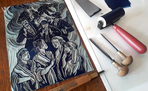
Taken from a scene in Act 5, chosen partly for its significance within the structure of the play, this image shows Richard on the eve of the Battle of Bosworth, visited in his sleep by a procession of ghosts of those he had killed. Each appears as an image of retribution foreshadowing Richard’s own imminent death. My choice of subject is equally driven by the image itself, primarily what might make for a strong or interesting picture, but I must also consider all the other illustrations in the book and try to put some clear water between each one. Again, it comes down to finding a unique and simple graphic that in this case simply says ‘Richard III’.

Illustration by Neil Packer
My influences as an illustrator are wide and varied, it is often a disappointment to hear where ideas come from for it is most probably as mundane as ‘life experience’. Ideas hide in plain sight; they are everywhere but one probably doesn’t recognise them as ideas at the time of absorbing them. They can swim around in your head for decades and then hopefully suggest themselves at the right moment. Looking back at this image now, more than a year after I made it, I can see that clearly the Elizabethan woodblock print is my starting point with all the unsettling atmosphere which usually attends them. But I can also see the influence of outsider art, particularly in the depiction of the ghosts I notice a little of my liking for Albrecht Durer’s engravings within the faces and I am pretty certain that Richard’s stance, with his weight on the two sticks, comes from Antony Sher’s legendary breakthrough performance of Richard III in 1984.
The Two Gentlemen of Verona
The Two Gentlemen of Verona is thought to be one of the earliest of Shakespeare’s works and its primary theme is the conflict between loyalty to friends and submission to passion. The two eponymous gentlemen are Valentine and Proteus, and the moral twists and turns of their journeys are at the heart of the play. However, much of the comedy is driven by the characters of their servants Lance and Speed, and the nature of their behaviour better helps us understand that of their masters. It would not have been socially acceptable for higher status characters to discuss subjects such as sex, money or class and so often the nuance of the primary characters’ relationships are related through the comedic musings of the servants, and this play is a fine example of such.

Illustration by Neil Packer
Another reason for choosing this scene and eventually the image I settled upon for this play is the presence of Lance’s dog Crab who is used to great comic effect being unmoved and indifferent to any of the tumultuous events reverberating around his human companions. It has been suggested that Crab is the funniest non-speaking role in all of Shakespeare, but more importantly Crab is the only dog in the whole of Shakespeare thus making his inclusion an obvious way of identifying the play.
At some point when I had finished the illustrations for this book, I conducted a blind experiment with a friend of mine who is very familiar with the works of Shakespeare. Sitting in a pub in the City of London that dates from not long after the First Folio was published, I conducted the ‘Caz’ test (Caz being my friend in question). I showed her the images from each of the plays but minus the title and she was charged with the task identifying each play from the image alone. I am pleased to report a 90% success rate at the first guess and pretty much 100% by the 2nd.
Cymbeline
The image for this illustration depicts the character of Iachimo emerging from a chest in which he has been hiding to steal Innogen’s bracelet. The choice of scene is yet again to clearly mark out the illustration as an image from Cymbeline. It is important to try to avoid ambiguity within the pictures and often a more famous or more key scene will work less well as it may be visually less unique. These images appear at the start of each play and are not directly next to the scene they represent so have to stand alone, and there can easily become a danger of showing a succession of unidentifiable figures gesturing at each other with no real sense of the unique flavour of each of the plays.

Illustration by Neil Packer
The stylistic inspiration for this illustration comes again in part from Elizabethan woodblock prints but perhaps equally from very early 20th century illustration by the likes of Aubrey Beardsley and Byam Shaw, with a healthy side helping of Egon Schiele. My focus for this project would probably have been entirely on the Elizabethan woodblock work, however I can’t but help elements from other passions, obsessions and studies of artworks from deep inside the recesses of my memory filtering through. In fact, it is something that I try to actively encourage.
In this case I have chosen to dress the character of Iachimo in Elizabethan costume to directly tie the image to the Shakespeare play. Other images of historical figures such as that of Antony and Cleopatra I have depicted in dress from their own period, to tie them to the real world, again this is a device to try and put as much clear water between the images as possible and is more of an intuitive conceit than intellectual.