This Folio Life: Letters from lockdown
We are so pleased to bring Charles van Sandwyk’s charming fairy letters to life in two beautiful Folio editions. It was a challenging project in terms of book production, with the journey to finished copies made even more complex due to working under the restrictions of COVID-19.
Kate Grimwade, Production Director
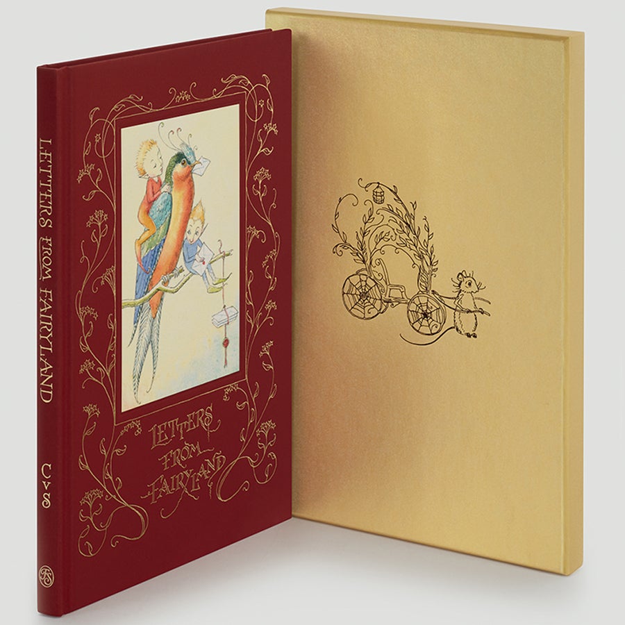
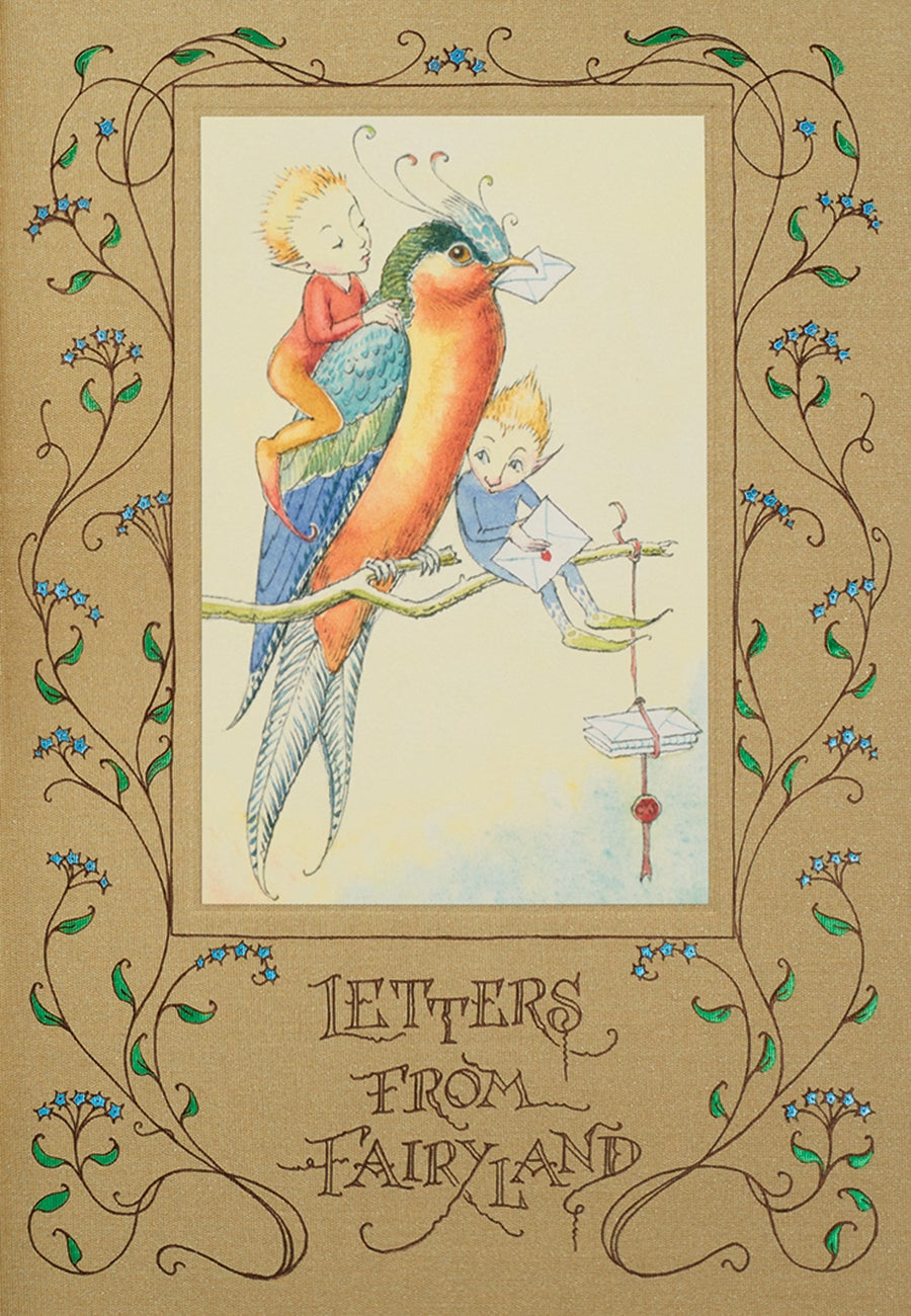
It was early October 2019 when I first held a copy of Charles van Sandwyk’s Letters from Fairyland. This was the book in its first incarnation, inspired by a letter Charles had received from a little girl wanting to know how to encourage fairies into her garden. Only a few copies were hand printed and sewn for members of Charles’s ‘High Branch Society’.
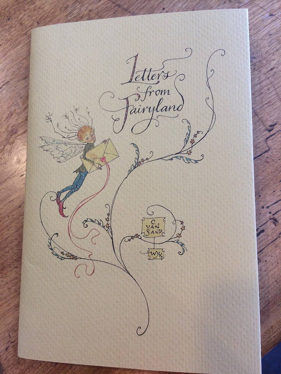
The first Letters from Fairyland, published for members of the High Branch Society
Charles had paid us a visit in London to discuss how we might turn this charming edition into a Folio book. This would involve Charles creating new artwork for the binding design and additional illustrations for the inside pages as well as for a limited edition. It was a very enjoyable meeting and we parted confident that with new artwork arriving in the spring, we had plenty of time to produce the Folio editions for Christmas 2020.
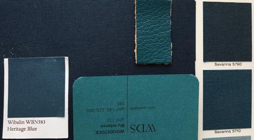
By the time the first artwork arrived at the end of March, the UK had entered ‘lockdown’. I had placed the printing and binding with Italian specialist binders Graphicom, based in Vicenza, close to the area then most affected by Covid-19. As they were enduring even tougher restrictions than the UK - Valentina, our account controller, was only allowed 100m from her front door and only a skeleton staff were at the factory - product development was painfully slow. To help, I made an early decision to source only Italian materials: the Modigliani text paper from Cordenons (Turin), coloured papers from Fedrigoni (Verona) and the gold cloth for the limited edition from Manifattura del Seveso (Bergamo).
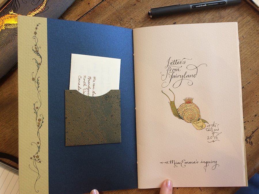
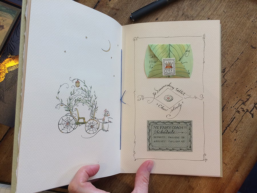
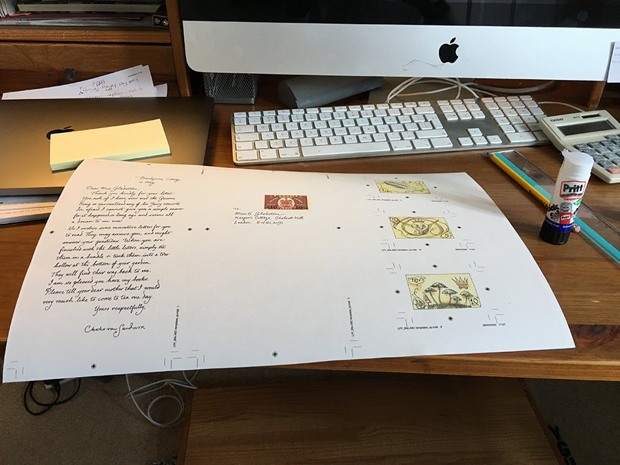
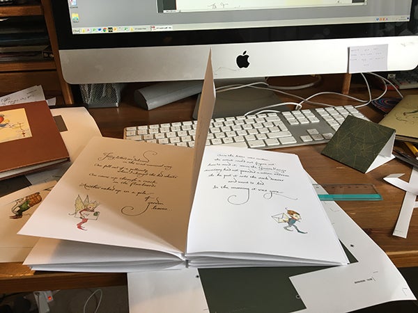
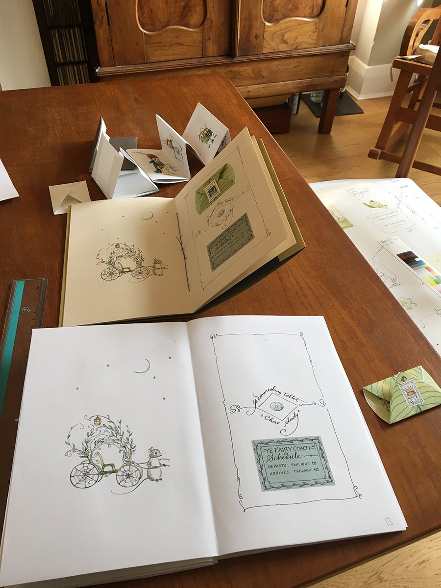
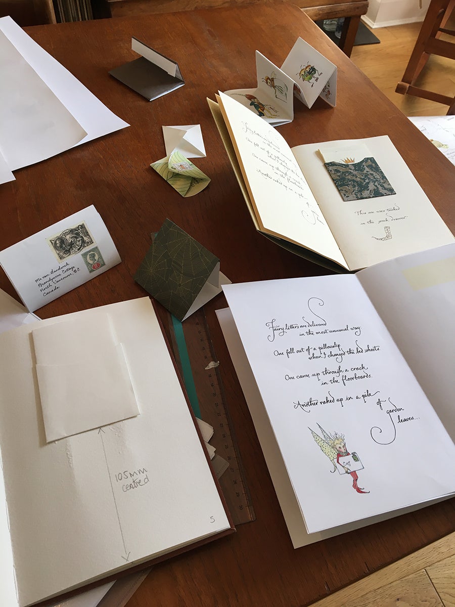
Letters from Fairyland required more handwork than Folio had ever undertaken: pockets to make and letters folded to fit in them, a leaf letter to tip on, fairy money in a treasure chest, a concertina of fairy people; and alongside this a limited edition with different material choices and a clamshell box. It was a complex product in normal times but was particularly challenging when the usual process of product development – team meetings in the Folio office paired with the same at Graphicom – was no longer possible. However, despite the challenges, I am delighted that the finished books are faithful realisations of Charles’s original vision.
I very much hope you enjoy the photographs taken throughout the process of making this book.
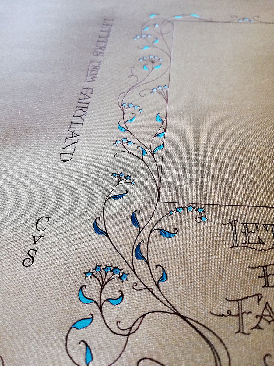
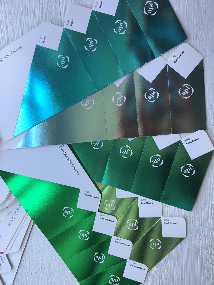
The first cover proof for the limited edition wasn’t quite right: pale blue and jade blue foils were chosen but they were too close in colour. A mint green foil was substituted for the jade foil, which gave a much better result, differentiating the flower petals from the leaves in Charles’s artwork.
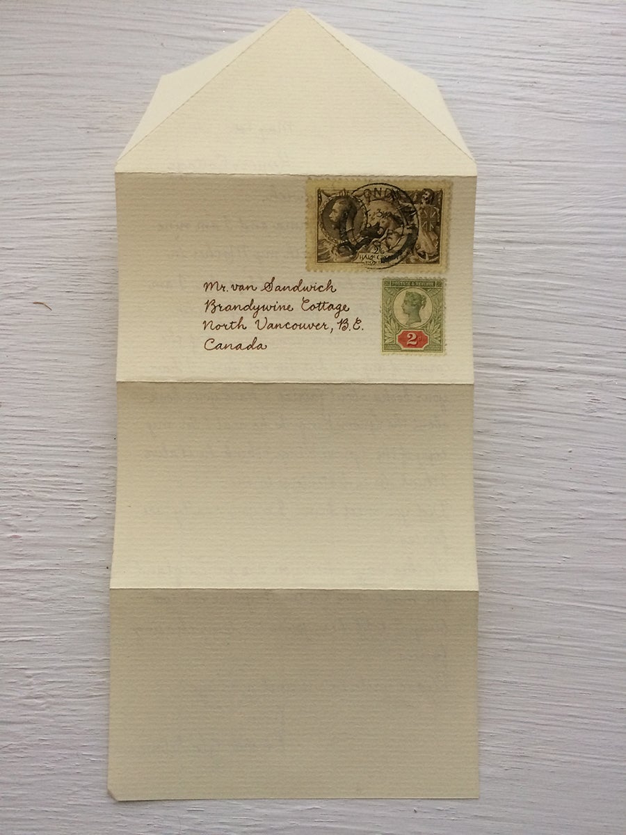
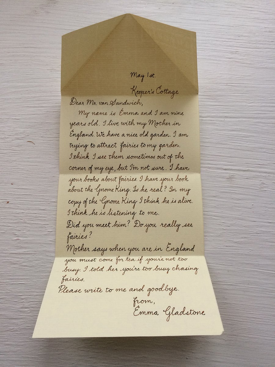
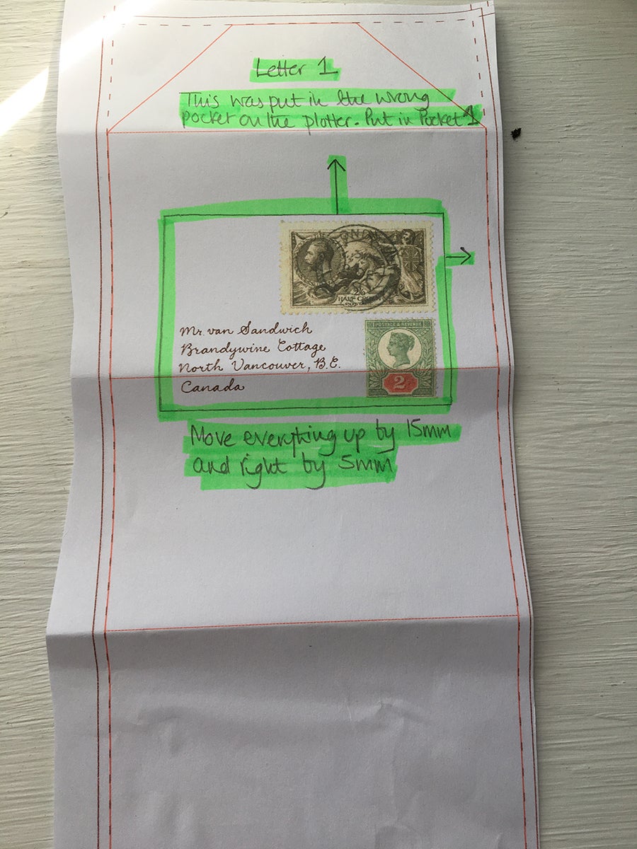
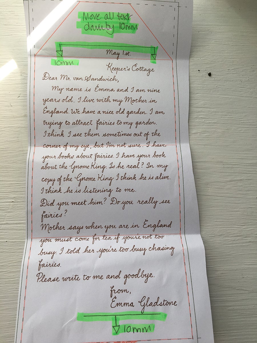
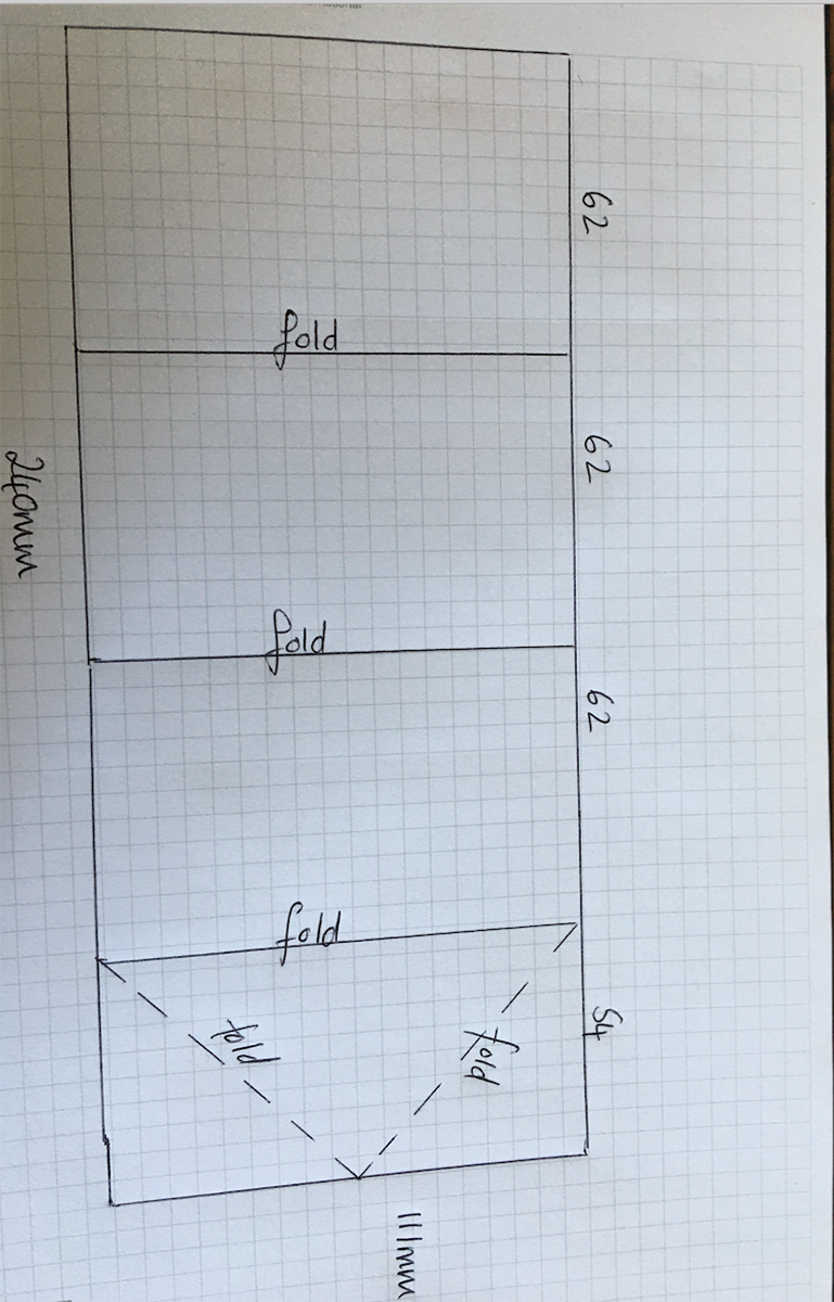
Fairy letters from Charles’s original publication; alongside my proofs marked up with corrections to positioning; alongside a diagram with folding instructions.
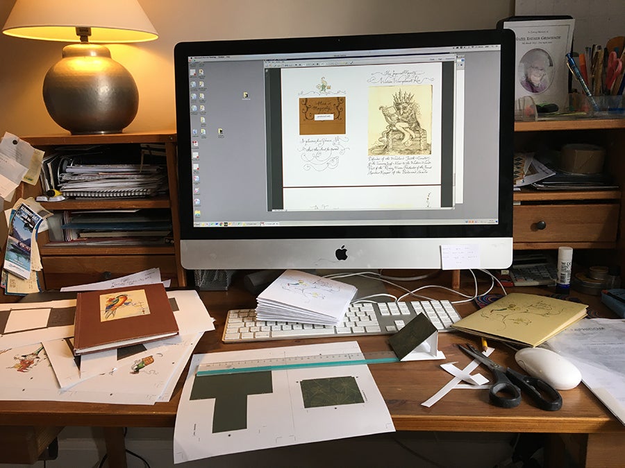
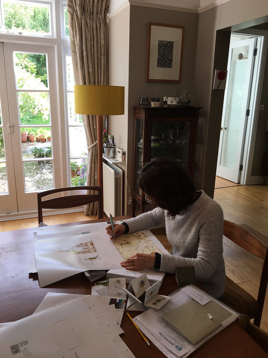
Comparing the paper proofs with files on screen.
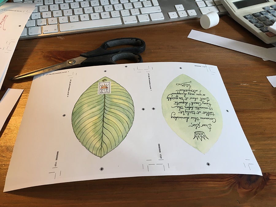
Comparing proofs of the Folio edition to the original publication, ensuring the leaf letter and pockets are positioned correctly
...and one final colour correction before going to press.
Find out more and order Letters from Fairyland - or the limited edition of Letters from Fairyland, signed by Charles van Sandwyk (fewer than 50 copies remain!).