This Folio Life: Larkin about with photography
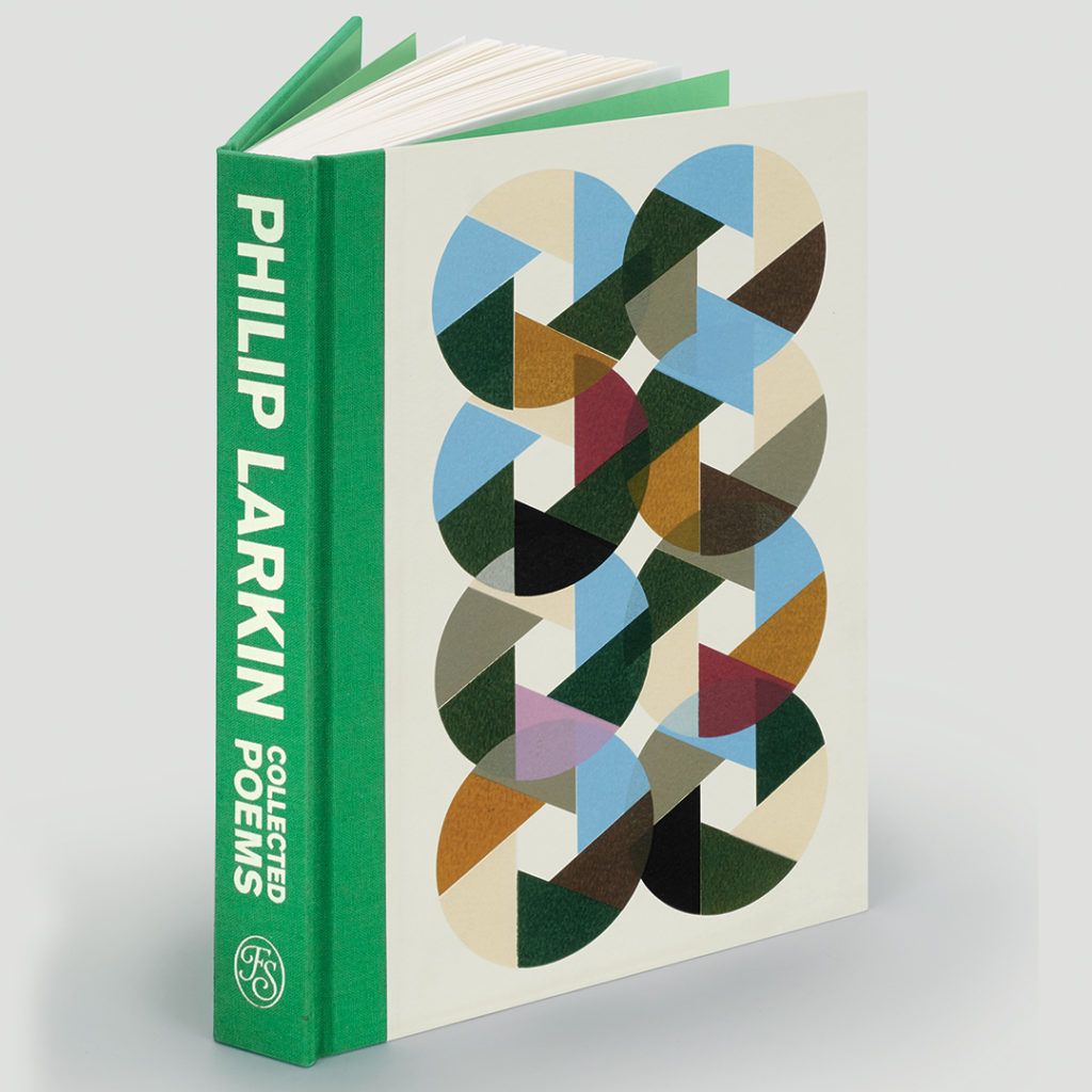
Our edition of the collected poems of Philip Larkin features a striking geometric binding design from London printmaker Richard Peacock. In this blog, Richard explains how he revisited Larkin’s poetry and continued to develop the shutter-like design after it was completed for the edition.
Sheri Gee, Art Director
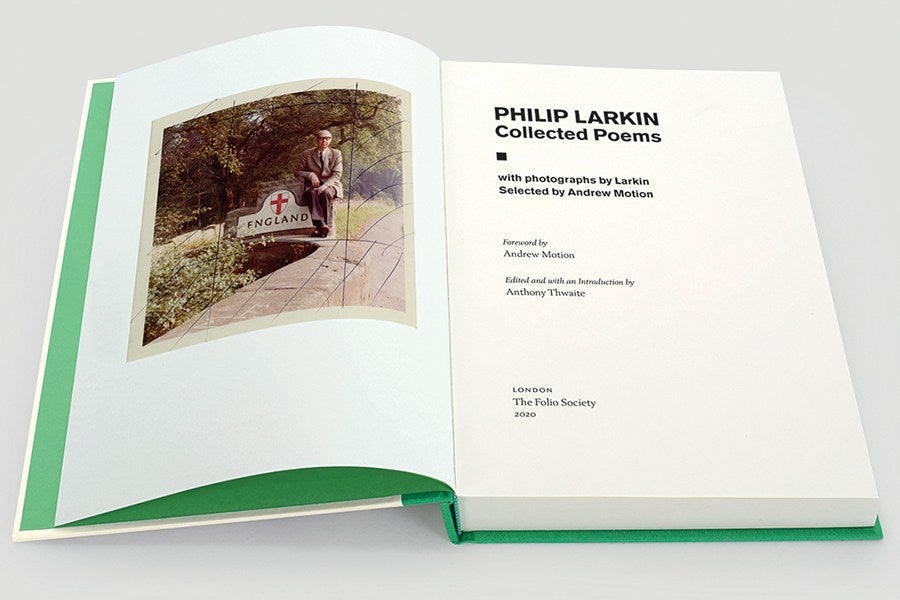 The Folio Society contacted me after having seen my work at a London Art Fair and I was delighted when they asked me if I would consider working on a binding design for them - even more so when they said it was for a new edition of Philip Larkin's poetry.
I have enjoyed Larkin's work since I studied it at college in the 1980s. I feel a degree of affinity with the poet as, like him, I divide my life between my artistic practice and working as a librarian (Larkin was Librarian at the University of Hull). His best work is of the highest quality and I have drawn inspiration from his ‘dual life’ since I graduated from my art degree in 2001. As well as having a screen printing studio, I am also currently the Librarian at the Whittington Health NHS trust in North London.
This commission took me back to Larkin's poetry. I was aware of his reputation in some circles as a conservative English misogynist, so I also read criticism of his work from both feminist and left-wing perspectives. I had always thought of his work as being very personal, sometimes bleak and revealing - on reading his work more widely again, I was struck by the lyricism beneath his everyday suburban persona and surprised by his modernism.
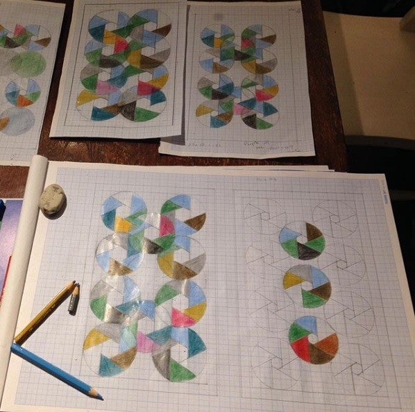 I worked with the initial brief that The Folio Society gave me and produced a range of image options for the book cover. Once we agreed on an image, I then created it as a limited edition screen print, which became the principal image on the binding.
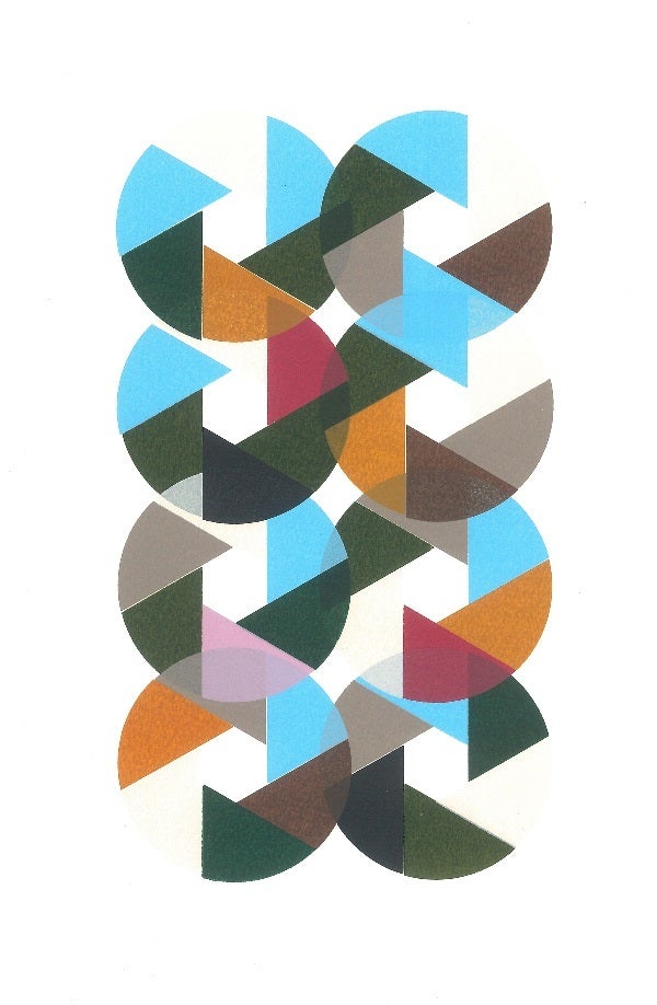 The overlapping segmented circles are based on the idea of the camera shutter, as the new Folio edition of Larkin's work is the only one to also feature his photography. The colours are chosen to reflect both the dirty town and the countryside.
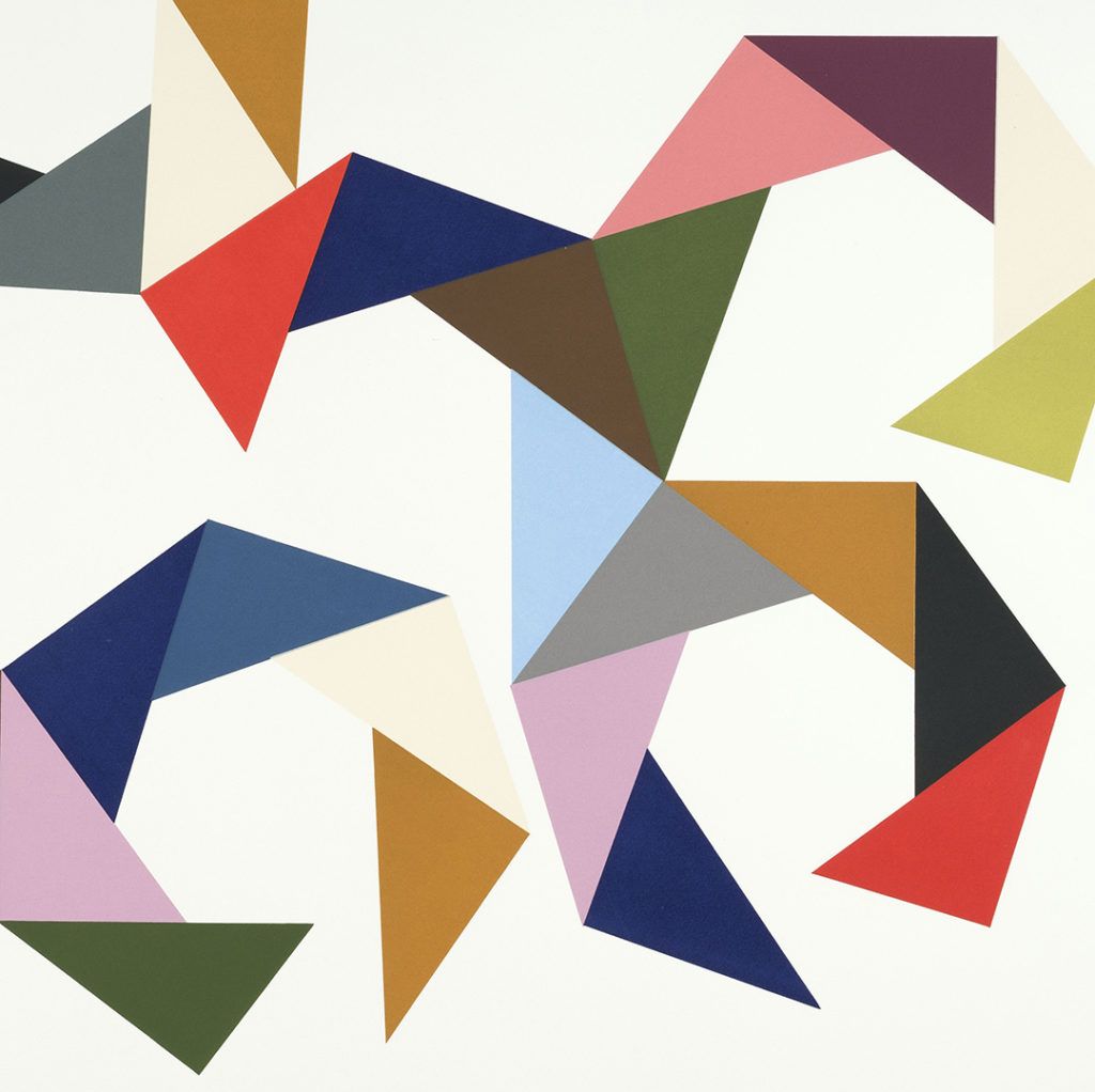
I liked the image and produced a second version as a woodcut (entitled Elemental) that was different in terms of texture and colour. I also tried to reproduce the image from a screen I already had set up, which featured a simple triangle. The angles of the shape were such that it was impossible to link up the segments into a circle – the shapes either overlapped or left a gap.
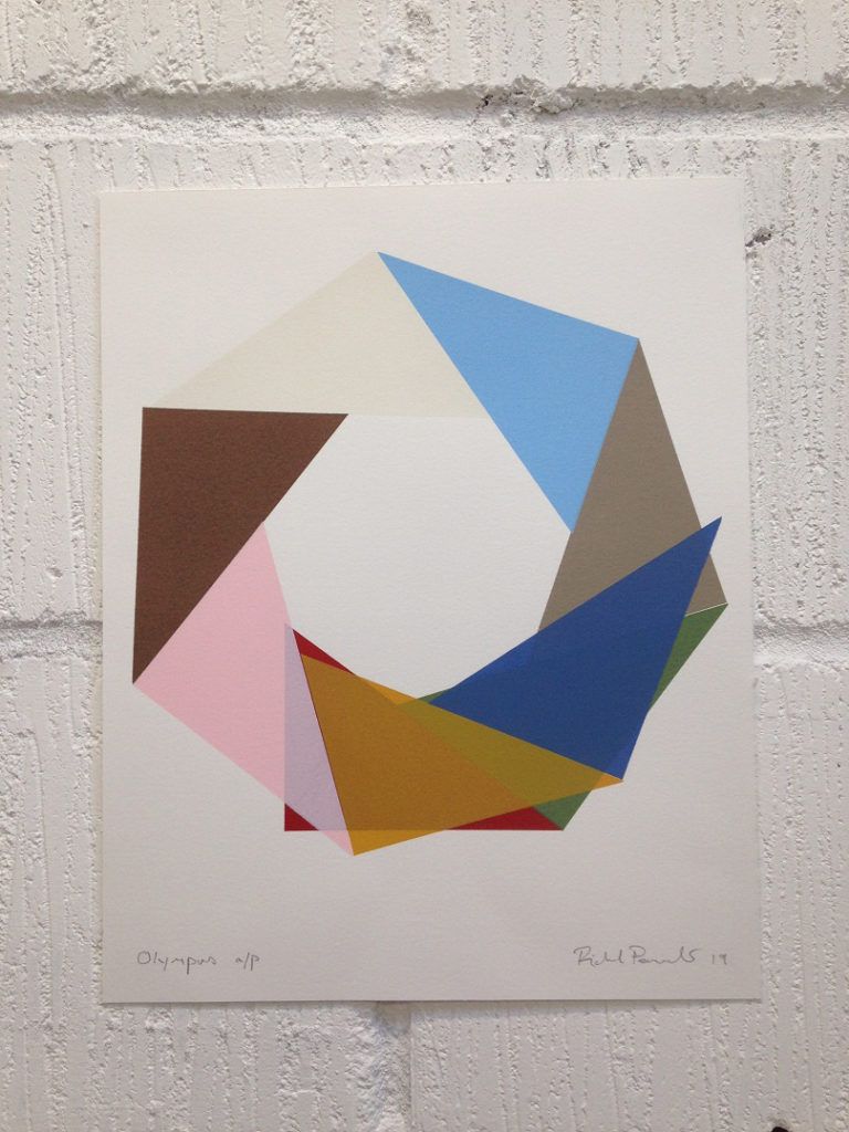 I was excited to find that this opened a whole new artistic avenue for me and I have worked with this over the last year or so, making a number of images which have grown step-by-step across the sheets of paper in my studio (see Burrs, Olympus, Thorns and Claws).
 This blog was written by artist Richard Peacock
 Find out more and order Collected Poems: Philip Larkin
 The Folio Society contacted me after having seen my work at a London Art Fair and I was delighted when they asked me if I would consider working on a binding design for them - even more so when they said it was for a new edition of Philip Larkin's poetry.
I have enjoyed Larkin's work since I studied it at college in the 1980s. I feel a degree of affinity with the poet as, like him, I divide my life between my artistic practice and working as a librarian (Larkin was Librarian at the University of Hull). His best work is of the highest quality and I have drawn inspiration from his ‘dual life’ since I graduated from my art degree in 2001. As well as having a screen printing studio, I am also currently the Librarian at the Whittington Health NHS trust in North London.
This commission took me back to Larkin's poetry. I was aware of his reputation in some circles as a conservative English misogynist, so I also read criticism of his work from both feminist and left-wing perspectives. I had always thought of his work as being very personal, sometimes bleak and revealing - on reading his work more widely again, I was struck by the lyricism beneath his everyday suburban persona and surprised by his modernism.
 I worked with the initial brief that The Folio Society gave me and produced a range of image options for the book cover. Once we agreed on an image, I then created it as a limited edition screen print, which became the principal image on the binding.
 The overlapping segmented circles are based on the idea of the camera shutter, as the new Folio edition of Larkin's work is the only one to also feature his photography. The colours are chosen to reflect both the dirty town and the countryside.
I liked the image and produced a second version as a woodcut (entitled Elemental) that was different in terms of texture and colour. I also tried to reproduce the image from a screen I already had set up, which featured a simple triangle. The angles of the shape were such that it was impossible to link up the segments into a circle – the shapes either overlapped or left a gap.
 I was excited to find that this opened a whole new artistic avenue for me and I have worked with this over the last year or so, making a number of images which have grown step-by-step across the sheets of paper in my studio (see Burrs, Olympus, Thorns and Claws).
 This blog was written by artist Richard Peacock
 Find out more and order Collected Poems: Philip Larkin
