
This Folio Life: From pitch to publication for True Grit
In our latest blog we follow the journey of True Grit – from the seed of an idea to the published edition.
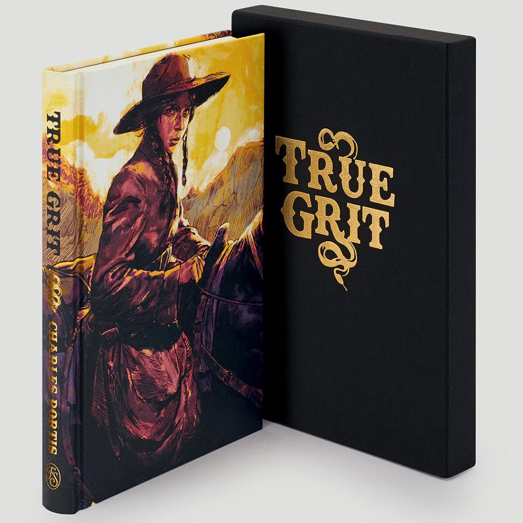
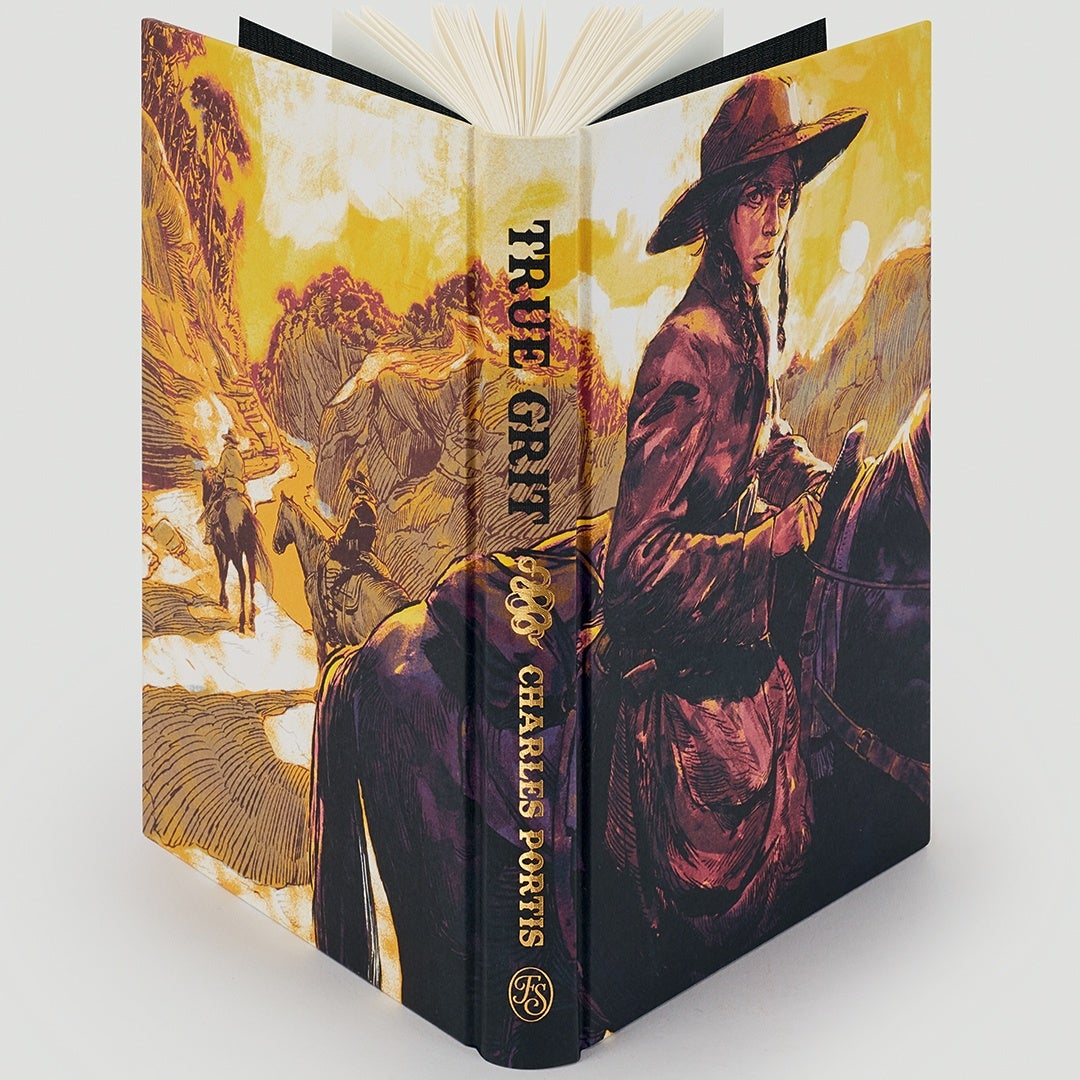
 But the design process doesn’t end inside the book; the binding and slipcase need just as much thought. For our edition, Juan continued the epic western theme with a stunning wraparound binding design that captures the scope of Mattie’s personal and physical journey.

 Find out more and order True Grit
How does a book become a Folio edition?
There are certain titles that will always justify a place in our library, but as we continue to diversify, and look beyond the traditional canon, publishing meetings have become livelier: this was certainly the case with True Grit. A brilliant narrative with some of the sassiest, most natural dialogue you’ll ever read, it has all the hallmarks of a contemporary classic. But there’s more: by choosing a young female protagonist in a male-dominated society, Charles Portis flipped the traditional western. For Publishing Director Tom Walker, it was a book that we simply had to publish, but the journey from idea to publication is a long one.Getting the team on board
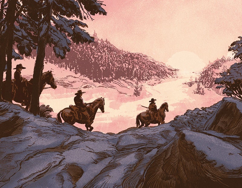
Although Tom was confident that everyone who read True Grit would fall in love with it, no book gets the go-ahead without being pitched across the company – from editors to the sales team, designers and production – enough Folio people need to fall in love with a book before we publish it. And, as we’re an illustrated publisher, there’s always a long discussion with our design team before a final decision is made. For True Grit, Art Director Raquel Leis Allion was keen to explore the book’s rich filmic history, and she began looking for an artist with that wonderful visual scope in mind. No edition moves forward until the right illustrator is found, as artwork is integral to our editions. In this instance, Juan Estaban Rodríguez couldn’t have been better suited to the brief: an illustrator specialising in film and gig posters, he immediately grasped and extended the concept, and the Folio edition of True Grit began to emerge.
The details that make a Folio book exceptional
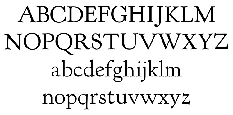
If you’re familiar with Folio books, you’ve probably noticed that we take our typefaces seriously. True Grit called for a font that would evoke the world of the Western, and we selected Kennerley – a bold font used on poster advertising in the early 19th century.
But the design process doesn’t end inside the book; the binding and slipcase need just as much thought. For our edition, Juan continued the epic western theme with a stunning wraparound binding design that captures the scope of Mattie’s personal and physical journey.
Unveiling the finished book
It’s no secret that we’re perfectionists and we won’t sign off a book until every last detail is perfect. Our production schedule for True Grit was pushed to the limit in order to get the binding lettering just right, and it’s the same for every book – it takes as long as it takes. But when the first printed editions arrive at the office, and the book looks even better than we imagined, all the time and effort spent on the detail is worthwhile.
Find out more and order True Grit