About Us


Who We Are
‘A company that takes pride in all that it does.’
- Perry, Canada, via Trustpilot
Folio is an employee-owned, independent publisher that has thrilled and delighted a band of dedicated readers since 1947. Today, from our workspace in the heart of London’s vibrant Shad Thames, we continue that tradition by crafting exquisite, illustrated editions for book lovers of all ages.
We publish books that have changed the world, books that entertain us, books that blow our minds … books that have stitched themselves into who we are. Which is why every Folio book is a labour of love, expertise and, frankly, obsession.
Our team of editors, designers and artisans will do whatever it takes to give each title everything it deserves, from outstanding intellectual firepower to extraordinary craftsmanship. Available exclusively from Folio through our website, for book lovers around the world, every book we make is a miniature work of art and we take pride in every single one.
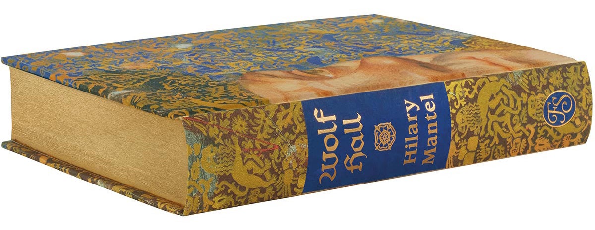
Every Folio book goes on an incredible journey from the spark of an idea to final publication. As a publisher at the heart of a golden age of book design, we constantly push the boundaries of bookmaking and creative possibilities. Our individually designed and illustrated hardback editions are often years in the making, but we never let a schedule stand in the way of perfection – every book takes as long as it needs.
‘If you love beautiful books, then The Folio Society should always be your first port of call.’
- Francesca, UK, via Trustpilot
From scouring the globe for the perfect illustrator, to selecting the typeface, paper and binding materials, each book draws on the skills, experience and passion of our editors, art directors, designers and production controllers. Many editions include traditional bookmaking and printing techniques, and we work closely with artisan suppliers, including Ludlow Bookbinders in Shropshire, Smith Settle in Yorkshire and specialist letterpress printer Phil Abel in London. Other books are crafted using the cutting-edge technologies of printers such as L.E.G.O. in Italy.
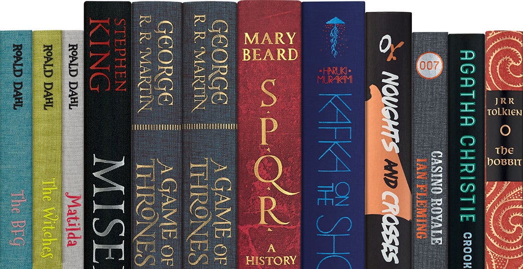
This pursuit of excellence has led to successful relationships with esteemed literary estates and world-renowned authors. Working closely with the Dahl, Tolkien, Fleming and Christie estates – and authors including Stephen King, Haruki Murakami, Mary Beard, Malorie Blackman and George R. R. Martin – we have created the most beautiful, illustrated editions of the authors’ works, many of which have become Folio bestsellers.
‘The Folio Society’s splendid new editions of the “Song of Ice and Fire” series are masterpieces of the bookmaker’s art.’
- George R. R. Martin

Our editions have also won prestigious awards (see below), including the V&A Book Illustration Awards, the British Book Production and Design Awards and the Association of Illustrators World Illustration Awards. While it is a huge honour to receive such accolades, it is our readers’ responses to our books that most excites and motivates us. Designed for longevity, delight and to build the world’s best collectors’ libraries, Folio editions are, above all, crafted for the ultimate reading experience.
‘The Folio Society sets the bar for exceptional customer service. Easy to order, quick to respond, and very pleasant to deal with.’
- Barry, Canada, via Trustpilot
Fine-book collectors, gift buyers, genre fans ... our beautiful editions grace the shelves of book lovers all over the globe. However, the attention to detail doesn’t end when the books are published.
Our tireless in-house customer service team knows every book inside and out, and they are on first-name terms with many of our longest-standing readers too. When things go wrong – and we know that they occasionally do – Andrew and the team personally deal with the issue and, crucially, solve it quickly. But don’t just take our word for it; you will see customer service praise pop up all over our Trustpilot reviews.
Of course, excellent service is just part of the customer experience. We take security very seriously: everyone at Folio has regular GDPR training and certification; Folio has Cyber Essentials Certification; and we have stringent checks and security built into every stage of our transaction and delivery process.
‘Folio maintains and exceeds its own standards, and it is a pleasure and a privilege to be one of their authors.’
- Hilary Mantel
A small, tight-knit team of book lovers, we’re proudly independent, punching above our weight in the publishing industry to create some of the most beautiful books in the world. Having recently become an employee-owned trust, we all now have a personal stake in Folio, so there is even more excitement for the future and no limit to our ambition.
‘The Folio Society is one of life’s little pleasures.’
- Timothy, USA, via Trustpilot
Our confidence comes from our collective knowledge, skills and expertise. From new Folio people to those who have worked here for more than 30 years, we’ve got centuries of publishing experience between us. Our passion for our books is at the heart of all we do, and we love the challenges and satisfaction of ensuring that every Folio book is the ultimate edition.
‘I was particularly impressed with the eco-aware packaging, using brown paper instead of bubble wrap. Kudos!’
- Tatyana, Israel, via Trustpilot
Our books are designed to last a lifetime; to be read, re-read and passed down the generations … a sustainable treasury of important and illuminating literature. We have a duty to ensure that our editions are produced and delivered in the most sustainable way. We’ve made progress on our sustainability journey so far, and we are committed to continue reducing our environmental impact at every stage of the book production process.
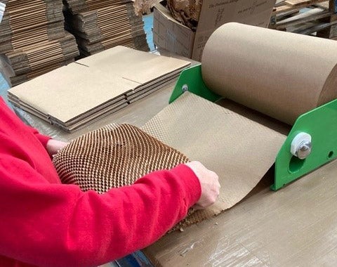
Our small print runs allow us to be very selective with suppliers and materials, and we work closely with chosen partners who have excellent environmental credentials. All our books are made using FSC accredited paper, most of which comes from the Munkedahl mill in Sweden. This is one of the cleanest mills in the world, with a long-standing commitment to sustainability: from sourcing raw materials to reducing energy consumption and CO2 emissions. And, when you order your books, they will be packaged in 100% recyclable paper and card, including paper tape on the boxes.
While we’ve come a long way, there’s still plenty more to do. Now that Folio is owned by its employees, we can make decisions as a collective and focus on what matters to us. Sustainability is at the heart of our vision to publish beautiful books that are planet friendly; books that support artisan industries, offer opportunities to illustrators and bring joy to our readers.
It is important to us that Folio supports our wider community. We work with a number of charities throughout the year, giving donations and time, individually and as a company. As well as our ongoing profit pledge we support seasonal appeals, which have included Black Friday initiatives that raise donations for BookTrust and supporting the Wrap Up London Christmas campaign.
1% Profit Pledge
Folio pledges to give 1% of our net profit each year to charitable causes chosen by a company-wide vote. Most recently we selected three: Trussell Trust (Pecan/Southwark Foodbank); British Red Cross Gaza Appeal and Alzheimer's Society. Each year we select three new charities to support.

For enquiries about The Folio Society or its books please contact our representatives.
For UK and European media enquiries:
Tom Neilson, Midas PR
Email: tom.neilson@midaspr.co.uk
For USA and Canada media enquiries:
Diffusion PR for The Folio Society
Email: folio@diffusionpr.com
For any other countries or further information, please contact press@foliosociety.com
If you would like to submit your illustrations for consideration, please see the relevant section in our FAQs.
For rights, author and estate enquiries:
Kaja Murawska, Head of Rights and Business Development
Email: kajam@foliosociety.com
2025
The Society of Illustrators of Los Angeles
Winner - Hilary Clarcq for Children of Dune (Cover), Gold Award in the Book category
The Society of Illustrators of New York
Hilary Clarcq for Children of Dune (Series), Jury Selection for the Illustrators Annual 67
2024
British Book Design and Production Awards
Winner - Book of the Year for Nineteen Eighty-Four (Limited Edition)
Winner - Best British Book for Nineteen Eighty-Four (Limited Edition)
Highly Commended - Fine Binding & Limited Ediition for The Long Way to a Small Angry Planet (Limited Edition)
Winner - Photographic Books for The Planets
Highly Commended - Literature for The Night Before Christmas and The Underground Railroad
Winner - Scholarly, Academic and Reference Books for On the Origin of Species (Limited Edition)
Winner - Best Jacket/Cover Design for The Underground Railroad
Highly Commended - Best Jacket/Cover Design for Iron Curtain
Art Director's Club - ADC Awards
Daniel Liévano for The Wind-Up Bird Chronicle won Gold Cube Winner
V&A Illustration Awards
Jorge González for The Shadow of the Wind winner for Adult Fiction
Mu Pan for Monkey runner-up for Adult Fiction
Canon Book Printer of the Year
Kingsbury Press - Bluetree Group for The Hitchhikers Guide to the Galaxy (Limited Edition)
Communication Arts Illustration Awards 2024
Gérard Du Bois for No Country for Old Men won an Award of Excellence
Edward Kinsella for Pet Sematary won an Award of Excellence
Laura Hope for Ordeal by Innocence won an Award of Excellence
Hilary Clarcq for Dune: Messiah has been accepted into the Communication Arts Illustration Annual 65 in Books category
The Society of Illustrators Los Angeles Awards
WINNER: Edward Kinsella for Pet Sematary won the Best in Show
2023
3x3 International Illustration Awards 2023
WINNER: Edward Kinsella for Pet Sematary won the Gold Award
British Book Awards 2023
The Folio Society was shortlisted for the Independent Publisher of the Year
The Art Directors Club of New York 2023
WINNER: Edward Kinsella for Pet Sematary won the Gold Cube Award
Communication Arts Illustration Awards 2023
WINNER: Audrey Benjaminsen for The Turn of the Screw in Books category
WINNER: Gérard DuBois for Blood Meridian in Books category
2022
British Book Production and Design Awards 2022
WINNER: 'The Song of Ice and Fire' series won the Brand/Series Identity category
WINNER: Philip K. Dick: Selected Short Stories won the Literature category
WINNER: The Origins of Totalitarianism won the Scholarly, Academic & Reference Books category
WINNER: The Divine Comedy won the Fine Binding & Limited Edition category
D&AD Awards 2022
WINNER: Wood Pencil for Philip K. Dick: The Complete Short Stories in the Book Design category
WINNER: Edward Kinsella won the Graphite Pencil for Misery in the Illustration category
V&A Illustration Awards 2022
WINNER: Gérard DuBois for The Road won the Moira Gemmill Illustrator of the Year Prize and Book Illustration Winner 2022
RUNNER-UP: Lela Harris for The Color Purple was runner-up in the Book Cover category
3x3 International Illustration Awards 2022
WINNER: Edward Kinsella for Misery won the Gold Cube
Communication Arts Illustration Awards 2022
WINNER: Gérard DuBois for The Road in Books category
WINNER: Neil Packer for The Divine Comedy (Limited Edition) in Books category
American Illustration - American Photography (AI-AP)
WINNER: Michael Philip Dunbabin for Sparkling Cyanide in AI41 American Illustration
British Book Awards 2022
The Folio Society was shortlisted for the Independent Publisher of the Year
2021
British Book Production and Design Awards
WINNER: The Phantom of the Opera for Literature category
2021 Dezeen Awards
WINNER: Philip K. Dick: The Complete Short Stories in Graphic Design Public Vote category
2021 Communication Arts Award of Excellence
3x3 The Magazine of Contemporary Illustration No.18
WINNER: Robert Carter for The Godfather won the Silver award
2021 Communication Arts
WINNER: Philip K. Dick: The Complete Short Stories won the Award of Excellence
AOI 2021 World Illustration Awards
WINNER: Shabazz Larkin for I Know Why the Caged Bird Sings in the Book Covers category
American Illustration - American Photography (AI-AP) 2021
WINNER: Robert Carter for The Godfather in AI40
The Art Director's Club 100th international awards for The One Club 2021
WINNER: Edward Kinsella for Misery won the Silver Cube in the Book category
Society of Illustrators in Los Angeles
WINNER: Robert Carter for The Godfather won the Gold Award in the Book illustration category
Society of Illustrators in New York
WINNER: Daniel Liévano for Kafka on the Shore won the Silver Medal
Illustration West 60
WINNER: Edward Kinsella for Misery
2020
The Art Director's Club 99th international awards for The One Club 2020
WINNER: Anansi Boys won the Bronze Cube
iJungle Illustration Awards 2020
MERIT: Robert Carter for The Godfather
AOI 2020 World Illustration Awards
WINNER: Francis Vallejo for Anansi Boys in the Commercial Publishing category
Hiii Illustration 2020 Awards
MERIT: Robert Carter for The Godfather
2019
British Book Production and Design Awards
WINNER: The Folio Book of Children's Poetry in the Literature category
WINNER: Ubik in the Best Jacket/Cover category category
3x3 The Magazine of Contemporary Illustration No.17
WINNER: Mark Smith for To Love And Be Wise won the Distinguished Merit and a Merit for The Franchise Affair
Spectrum 26 Awards
WINNER: Francis Vallejo for Anansi Boys in the Book category
D&AD Awards 2019
WINNER: Anansi Boys, illustrated by Francis Vallejo, won a wooden pencil in the Book Design: Illustrated Book and Graphic Novel category
Communication Arts Illustration Awards 2019
WINNER: Mark Smith for Miss Pym Disposes in Books category
WINNER: Anna and Elena Balbusso for Atlas Shrugged in the Books category
WINNER: Francis Vallejo for Anansi Boys in Books category
ADC Annual Awards 2019
WINNER: Victo Ngai won a silver cube in Illustration for the Folio limited edition of The Kama Sutra of Vatsyanana
MERIT: Yuko Shimizu won a merit for Japanese Tales
American Illustration - American Photography (AI-AP) 2019
WINNER: Romy Blümel for Tales of the Greek Hereos in AI38
2018
V&A Illustration Awards 2018
WINNER: Book Illustration Category and Moir Gemmill Illustrator of the Year John Vernon Lord for Ulysses
D&AD Awards 2018
The Hundred and One Dalmatians illustrated by Sara Ogilvie won a wooden pencil for book design in Children's and Young Adults category
Communication Arts Illustration Awards 2018-04-27
Finalists: Edward Kinsella for East of Eden and Darya Shnykina for Mansfield Park
Society of Illustrators
WINNER: Hamilton King Award to Victo Ngai for the Folio limited edition of The Kama Sutra of Votsyayono
WINNER: Silver Medal in the Book Category to Yuko Shimizu for Japanese Tales
The Society of Illustrators of Los Angeles
WINNER: Bronze Medal to Mark Smith for The Daughter of Time
The British Book Design & Production Awards 2018
WINNER: Literature category for The Little Prince
2017
The British Book Design & Production Awards 2017
Winner of Scholarly, Academic and Reference Book category Micrographia
2016
British Book Design & Production Awards 2016
Winner Best British Book and Book of the Year: Alice in Wonderland Winner Best Brand/Series Identity: Folio Collectables
V&A Awards 2016
Winner Best Book Cover Illustration and Moira Gemmill Illustrator of the Year: David McConochie for The Folio Book of Ghost Stories
Design and Advertising Association Pencil Awards 2016
Winner Wood Pencil: Frank Herbert for Dune
2015
British Book Design and Production Awards
Winner Literature category: The Narrative of Arthur Gordon Pym
Winner Scholarly, Academic and Reference Books category: The Herefordshire Pomona
V&A Illustration Awards 2015
Winner Book Illustration Award and Illustrator of the Year: Sterling Hundley for Treasure Island
2014
American Illustration 33, 2014 annual
Selected for inclusion: The Day of the Jackal illustrated by Tatsuro Kiuchi
Association of Illustrators 2014
Winner: Geoff Grandfield, Professional Book Illustration Award for The Alexander Trilogy
V&A Illustration Awards 2014
Winner: Anne-Marie Jones for Sons and Lovers for Best Illustrated Book Cover
3x3 International Proshow No.11
Distinguished Merit: Anna and Elena Balbusso for Pride and Prejudice in the illustrated book category
2014 Communication Arts Award Of Excellence
Winner: Anna and Elena Balbusso for Pride and Prejudice in the Book category
2013
Longman-History Today Awards
Winner of Historical Picture Researcher of the Year - Cathie Arrington, for Dialogue Concerning the Two Chief World Systems
The Society of Illustrators
Professional Award for Design - Jonathan Burton, Odds & Bods Playing Cards. (His design was also given the Overall Professional prize, the highest award of the evening.)
3x3 The Magazine of Contemporary Illustration
Five of our illustrators have been awarded a merit in the book category of the prestigious 3x3 Professional Show No.10, hosted in the USA
V&A Book Illustration Award
Winner of Book Category - Anna and Elena Balbusso, Eugene Onegin
Association of Illustrators Illustration Awards
Design Category Winner - Jonathan Burton, Odds & Bods Playing Cards
Society of Indexers
Wheatley Medal Winner - Gerard Hill, Hannibal
Society of Illustrators 55, Book Category (US)
Gold medal - Anna and Elena Balbusso, for 'Tatyana', Eugene Onegin
Gold medal - Raquel Leis Allion for Art Direction, Eugene Onegin
Society of Illustrators 55, Sequential/Series (US)
Silver medal - Jonathan Burton, Odds & Bods Playing Cards
Silver medal - Sheri Gee for Art Direction Communication Arts Award for Excellence
Silver medial - Anna and Elena Balbusso, Eugene Onegin
2012
British Book Awards
The Folio Society was shortlisted for the Independent Publisher of the Year
British Book Design and Production Awards
Winner of the Limited Edition Category - Gulliver's Travels
Winner of the Literature Category - Fahrenheit 451
Society of Illustrators 54, Book Category (US)
Gold medal - Anna and Elena Balbusso, The Handmaid's Tale
Gold medal - Sheri Gee for Art Direction
Silver medal - Sam Weber, Fahrenheit 451
Silver medal - Sheri Gee for Art Direction
Communication Arts
Award for Excellence - Anna and Elena Balbusso, The Handmaid's Tale and First Love
Applied Arts Magazine
Award of Excellence 2012 Photography and Illustration Award - Anna and Elena Balbusso, The Handmaid's Tale
The Folio Society Brand Book/Our brand identity/ Awards
V&A Illustration Award
Best Illustrated Book Cover - Matthew Richardson, The Outsider
Longman-History Today Awards
Joint Winner of Historical Picture Researcher of the Year - Caroline Hotblack for Black Sea
2011
Association of Illustrators, Images 35, Books Category
Silver - Jonathan Burton, The Hitchhiker's Guide to the Galaxy
2010
D&AD Awards
In Book (bronze equivalent) - Sam Weber, Lord of the Flies
Association of Illustrators, Images 34, Books Category
Gold - Simon Pemberton, The Songlines
Silver - Jonathan Burton, Cover Her Face Bronze
Silver - Niroot Puttapipat, Myths and Legends of Russia
3x3 Pro Show, Book Category
Silver - A. Richard Allen, Brat Farrar
Merit - Jeff Fisher, The Hunting of the Snark; Daniel Haskett, As I Walked Out One Midsummer Morning
Longman-History Today Awards
Winner of Historical Picture Researcher of the Year - Julie McMahon for Stalingrad
2009
Association of Illustrators, Images 33, Books Category
Gold - Geoff Grandfield, Blackmailers Don't Shoot
Bronze - Swava Harasymowicz, Birdsong
V&A Illustration Award
Best Illustrated Book and Overall Winner - Tom Burns, The New York Trilogy
Design Week Awards
Editorial Design Category Winner - The Sea, The Sea, Tatsuro Kiuchi
2008
Association of Illustrators, Images 32, Books Category
Gold - Tom Burns, The New York Trilogy