This Folio Life: Designing Sophie’s World
When Charlotte Tate, Folio’s designer, and Sophie Lewis, editor for Folio’s edition of Sophie’s World, began to consider how we could publish this work, they looked hard at how author Jostein Gaarder had structured his text and how previous publishers had carried this through into their book designs. From there, they developed a smart and subtly radical approach, one that could only come from The Folio Society. Here they describe the process that led them to the Folio edition of Sophie’s World.
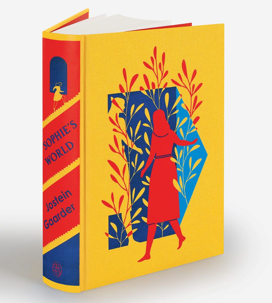 Sophie’s World is not a simple book. Within the story of Sophie approaching her fifteenth birthday in Norway and planning a party to celebrate that and the summer solstice, there is also the story of the entire history of western philosophy, which we read along with Sophie, as she receives it, in a series of thematic philosophy lessons. And while philosophising along with Sophie, you’ll soon start thinking, as she does, that there may be more overlapping worlds out there than these two alone, perhaps many more.
Confining our research to the two main ‘voices’ or narratives that emerge early on – Sophie’s story and the philosophy course – we found that many editions set the two interlaced voices in different typefaces, some using ‘sister’ fonts in serif and sans serif. But with packed pages and narrow margins, the two voices remained hard to distinguish in every edition that we consulted – and some were even quite confusing in places.
As for all Folio books, the reader is at the heart of our design: our editions must be a comfortable reading experience. This also means moreover that the author’s entire project should be realised by our design: if there are different voices, we should display them distinctly and allow the reader to follow the narrative’s development as closely and easily as possible.
For our edition of Sophie’s World, Charlotte designed the main text quite traditionally and typeset it in Freight Text. However, she chose to set the philosophy text in the companion typeface Freight Sans. This humanist typeface has a warmer, friendlier appearance than the likes of Helvetica or Univers – and it also has a clean, fresh feel to it, a style recalling the Scandinavian home of the original book. The typeface also has a large x-height (the physical height of the letters), which makes it readable for large bodies of text.
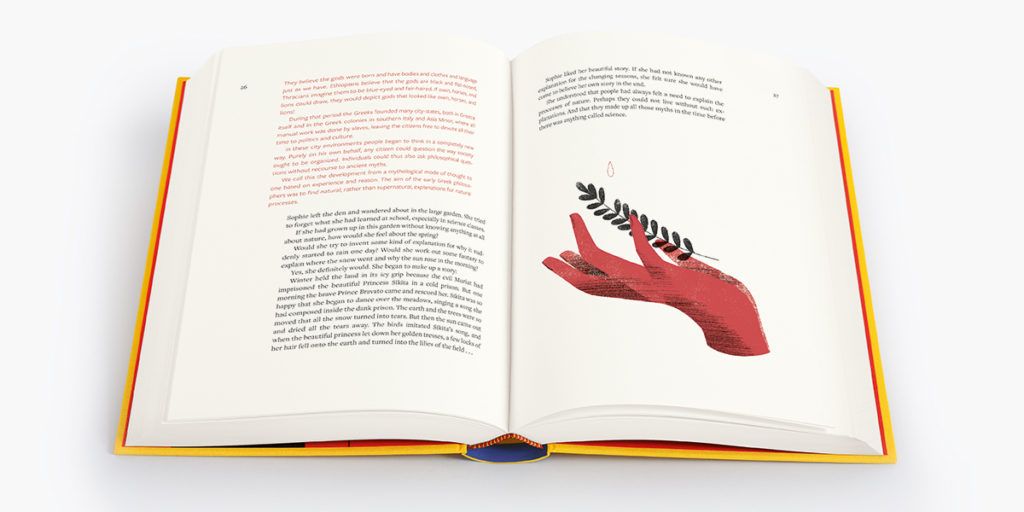 In addition, we decided to set our two voices in two different colours. Sophie’s story appears in classic black type, while the philosophy course is printed in a gently glowing scarlet, carefully chosen for warmth and readability. It’s also the same red that artist Sandra Rilova used for her brilliantly philosophical, text-inspired illustrations. Our text flows through, into and around the art that illustrates it.
What’s more, Charlotte says, ‘I wanted our edition to have a clean, minimalist yet functional design. By carefully integrating two sets of page margins, I would effectively be designing two books within one.’
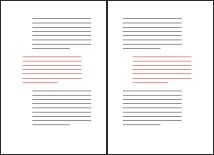 The image above shows her overall plan – a symmetrical design, rather than asymmetric, whereby the philosophy text is indented away from the spine.
This may seem simple enough, but unfortunately this is where the designer’s vision and what is possible with current technology can find themselves in conflict. Both the main text and the philosophy course include long passages of text, inevitably spanning multiple pages. They needed be placed relative to the book’s spine, rather than being universally indented to the left or right.
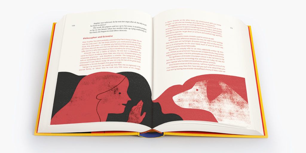 Charlotte comments: ‘The powers of design software can aid a designer so much these days, however to do what I proposed was one step too far for such a large section of text!’ She spent weeks carefully typesetting every paragraph by hand to ensure that it was seamlessly applied to the correct grid system. She says, philosophically, ‘Our passion for creating the best edition possible means we won’t let anything hold us back.’
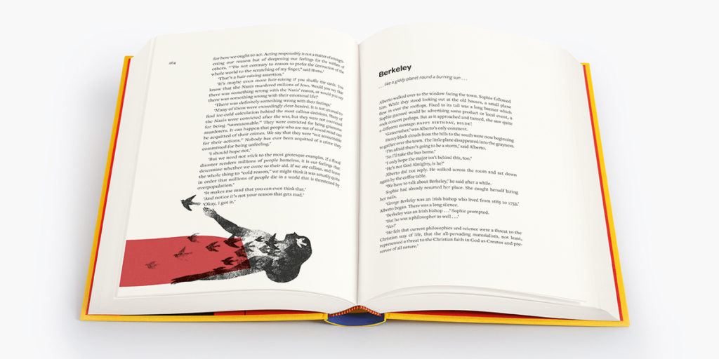 Then came Sophie Lewis’s second part in the project: she had to check every switch between the voices, to make sure Charlotte had got it right – even with one-line quotations set inside larger bodies of text, or when Sophie in the book starts corresponding by postcard with Hilde, another girl her age who seems to be living in yet another world. Take a look at your copy, especially pages 273-88, 302-3 and 422, for some dazzling examples of where our text switches back and forth between the two voices and the two-type grids in virtuoso style. We feel we’ve matched the exhilaration of the mind-expanding, world-exploding ideas laid out with such deceptive simplicity in Gaarder’s book.
This blog is by Charlotte Tate, Senior Designer, and Sophie Lewis, Managing Editor at The Folio Society
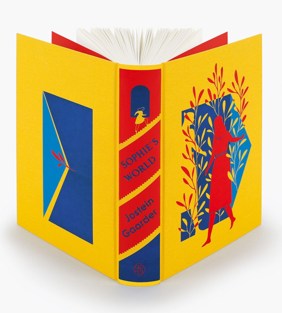 Find out more and order Sophie's World
 Sophie’s World is not a simple book. Within the story of Sophie approaching her fifteenth birthday in Norway and planning a party to celebrate that and the summer solstice, there is also the story of the entire history of western philosophy, which we read along with Sophie, as she receives it, in a series of thematic philosophy lessons. And while philosophising along with Sophie, you’ll soon start thinking, as she does, that there may be more overlapping worlds out there than these two alone, perhaps many more.
Confining our research to the two main ‘voices’ or narratives that emerge early on – Sophie’s story and the philosophy course – we found that many editions set the two interlaced voices in different typefaces, some using ‘sister’ fonts in serif and sans serif. But with packed pages and narrow margins, the two voices remained hard to distinguish in every edition that we consulted – and some were even quite confusing in places.
As for all Folio books, the reader is at the heart of our design: our editions must be a comfortable reading experience. This also means moreover that the author’s entire project should be realised by our design: if there are different voices, we should display them distinctly and allow the reader to follow the narrative’s development as closely and easily as possible.
For our edition of Sophie’s World, Charlotte designed the main text quite traditionally and typeset it in Freight Text. However, she chose to set the philosophy text in the companion typeface Freight Sans. This humanist typeface has a warmer, friendlier appearance than the likes of Helvetica or Univers – and it also has a clean, fresh feel to it, a style recalling the Scandinavian home of the original book. The typeface also has a large x-height (the physical height of the letters), which makes it readable for large bodies of text.
 In addition, we decided to set our two voices in two different colours. Sophie’s story appears in classic black type, while the philosophy course is printed in a gently glowing scarlet, carefully chosen for warmth and readability. It’s also the same red that artist Sandra Rilova used for her brilliantly philosophical, text-inspired illustrations. Our text flows through, into and around the art that illustrates it.
What’s more, Charlotte says, ‘I wanted our edition to have a clean, minimalist yet functional design. By carefully integrating two sets of page margins, I would effectively be designing two books within one.’
 The image above shows her overall plan – a symmetrical design, rather than asymmetric, whereby the philosophy text is indented away from the spine.
This may seem simple enough, but unfortunately this is where the designer’s vision and what is possible with current technology can find themselves in conflict. Both the main text and the philosophy course include long passages of text, inevitably spanning multiple pages. They needed be placed relative to the book’s spine, rather than being universally indented to the left or right.
 Charlotte comments: ‘The powers of design software can aid a designer so much these days, however to do what I proposed was one step too far for such a large section of text!’ She spent weeks carefully typesetting every paragraph by hand to ensure that it was seamlessly applied to the correct grid system. She says, philosophically, ‘Our passion for creating the best edition possible means we won’t let anything hold us back.’
 Then came Sophie Lewis’s second part in the project: she had to check every switch between the voices, to make sure Charlotte had got it right – even with one-line quotations set inside larger bodies of text, or when Sophie in the book starts corresponding by postcard with Hilde, another girl her age who seems to be living in yet another world. Take a look at your copy, especially pages 273-88, 302-3 and 422, for some dazzling examples of where our text switches back and forth between the two voices and the two-type grids in virtuoso style. We feel we’ve matched the exhilaration of the mind-expanding, world-exploding ideas laid out with such deceptive simplicity in Gaarder’s book.
This blog is by Charlotte Tate, Senior Designer, and Sophie Lewis, Managing Editor at The Folio Society
 Find out more and order Sophie's World
