This Folio Life: Creating Dinosaurs
Art Director Sheri Gee talks about commissioning illustration for Folio’s new edition of The Rise and Fall of the Dinosaurs, and working with renowned palaeo-artist Davide Bonadonna.
Commissioning The Rise and Fall of the Dinosaurs binding
When we were first discussing this book, we thought it would be really interesting to commission a palaeo illustrator for the cover and perhaps for some inside art to accompany the researched photos, making sure that by doing so we grounded everything in accuracy based on the latest research. Author Steve Brusatte and I discussed a few directions and were both delighted that Davide Bonadonna was willing and able to jump onboard.
For the binding, I’d discussed an initial concept of live dinosaurs walking with their skeletons reflected, in a very immediate response to the brief. I was able to create a loose concept rough which really needed the skill of Davide to take it forward and realise properly, which thankfully he was more than able to do.
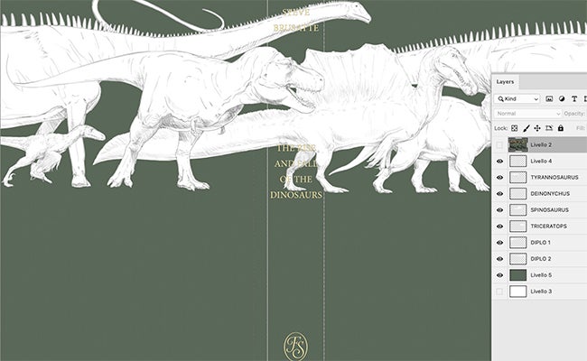
I was sent a wonderful line-up of dinosaurs all on separate layers so I could make the best arrangement around the spine type. As we worked through the approval stages, seeing the dinosaurs laid out on the cover we needed something top right, and Steve had the cracking idea of adding an eagle, ‘A modern bird, so no need for a corresponding skeleton below’, to follow up on the major theme of the book being the link between dinosaurs and birds.
I was so blown away by the attention to detail in Davide’s dinosaurs, which is why you see them again on the slipcase – they just needed to be shown closer up to do them justice.
Creating the fold out
Following on from the cover, we wanted to commission some artwork for a lovely big double fold out, which would run across 4 pages, but the fun came in trying to work out what would be on the reverse. When the long illustration is folded in the book, whatever is printed on the reverse needed to work in a multitude of ways, as the reader views it folded and unfolded. The simplest thing seemed to be to commission a second long illustration but to use it in a clever way so that everything would look brilliant, no matter how you opened it.
That took some explaining to make sure everyone understood what I had in mind...
The long illustration on the centre spread (pages 3-6) would be straight forward and be read easily.
The one on the other side, however, would be placed differently and would never be seen by the reader as a long illustration, though they would see sections of it, either as a single page illustration (pages 1 and 8) or a double page (pages 1&2, 2&7, 7&8).
Thinking about just this reverse of the gatefold:
This first photo shows how it would look printed, but no one will ever see it like this as it will be sewn into the book block on that centre fold (overlooking my awesome dinosaurs!)
First you’d see the double page spread, but the pages also work well as single pages.
Middle spread when the pages are folded:
Final double page spread but also the pages work well as single pages:
Following the initial briefing, it was decided that each long illustration should depict different formations – on the centre spread we have the Morrison Formation and on the reverse, dinosaurs from the Hell Creek Formation.
Davide worked up some superb roughs which we were able to check to see if it was all going to plan, albeit the arrangement changed a little along the way. The following shows what the actual final artwork looks like alongside a screenshot of how it’s printed.
Absolutely mesmerized by the new @foliosociety edition of The Rise and Fall of the Dinosaurs!
— Steve Brusatte (@SteveBrusatte) March 18, 2022
Thanks so much to all of my friends at the Society for turning my words into visual art. A huge honor to be in your catalog! #FossilFriday
Here's a sneak peak at the new goodies inside: pic.twitter.com/B76ltRXmvF


