This Folio Life: Tracking down a typewriter and finding fonts for the making of Misery
An important plot point in Stephen King’s brilliantly unsettling thriller Misery involves a specific typewriter with a missing key. When crafting the stylish new Folio edition, our Senior Designer Charlotte turned detective in her quest to source the typewriter and research historically accurate fonts.

A stickler for detail
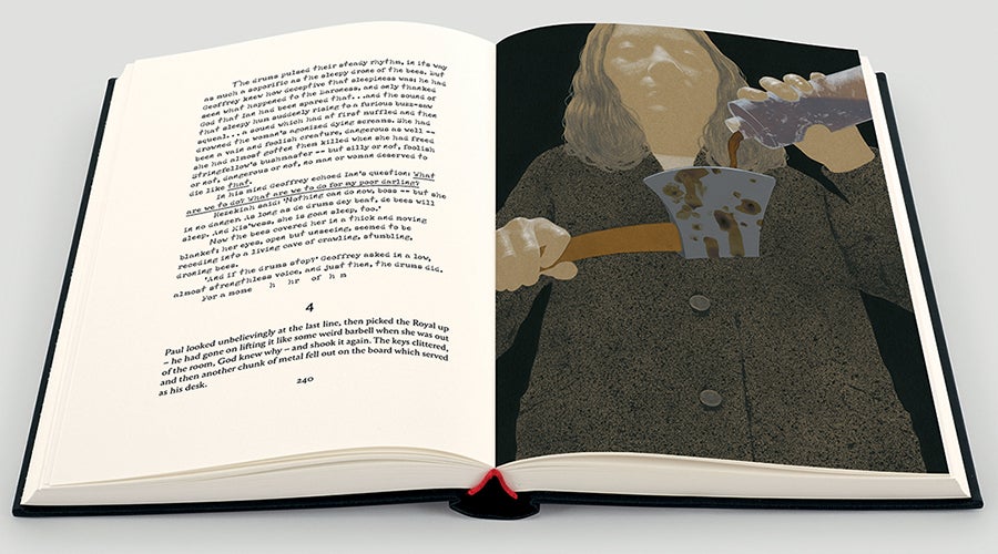
King gives a very precise description of the typewriter that his protagonist Paul Sheldon is given by his captor: a Royal 10 with a missing letter ‘n’. As the imprisoned author produces the novel that will secure his release, he must hand-write these letters in the manuscript, a task that becomes more painstaking as two more keys break. In order to replicate these sections of the novel without interfering with the reading experience, we had to select typefaces that were not only historically accurate but also easy to read.
Our designer turns detective
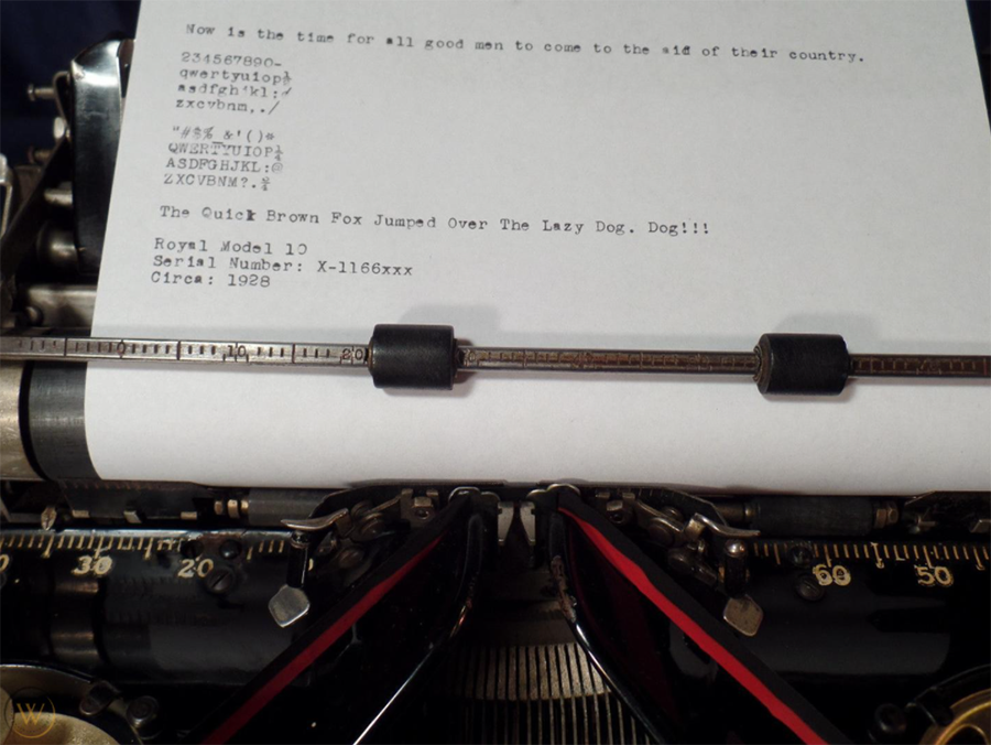
Our Senior Designer is used to researching typefaces that reflect the content and era of Folio editions but Misery presented a new set of challenges. The first task was to find a Royal 10 Typewriter and discover its most commonly used typeface. This turned out to be Pica and, as a version of this typeface was digitised in 1990 (and renamed Pica 10), this could be replicated in print.

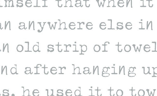
However, the typewriter in the book was secondhand and not in the best condition, so anything that reproduced a very crisp and clean type wouldn’t look accurate. The research continued until Typeka was finally selected. A typeface with similar letterforms to the original Pica, it also has the slightly distressed appearance that would be a true representation of the Royal 10.

Unfortunately, Typeka doesn’t have a specifically designed italic font so the next task was to find a suitable alternative. After trialling various combinations, our designer selected Chandler42 Oblique, which sits alongside Typeka very well, while also being a close visual match to Royal Pica Italic.

Matching the missing letters
As both King’s book and Sheldon’s manuscript gain pace, more typewriter keys break and Sheldon must eventually write every ‘t’ and ‘e’ by hand as well. The next challenge for our designer was to find a cursive typeface that stood out as ‘handwritten’ but also seamlessly blended into the text. The letter ‘t’ can be too angled (ITC Grimshaw Hand Regular), or easily mistaken for an ‘I’ if the crossbar is too small (Bergell Plain); tall ascenders can be uncomfortably close to the line above (Bergell Plain) or letterforms can appear too wide (Adobe Handwriting Ernie). In the end, Marydale was selected, as the letterforms don’t overpower the typewriter typefaces and, most importantly, they are readable. They needed to look obviously handwritten without sitting too boldly or awkwardly on the page.

Typesetting the book
Once all the typefaces had been chosen and checked, it was time to typeset the book, paying particular attention to ensure the styling exactly followed King’s text and that the correct ‘handwritten’ letters dropped out in the right places throughout. Fortunately, typesetting software can help here and, from set points within the book, our designer could carefully modify the paragraph and character styles to assign the cursive letters. The book was then proofread twice with extreme care, to ensure everything was how it should be. A time-consuming but extremely rewarding project, Misery is now a Folio bestseller.


