
This Folio Life: Unmasking the Phantom
Our edition of Gaston Leroux’s gothic horror novel The Phantom of the Opera features arresting full-colour illustrations from artist Taylor Dolan. In this blog, Taylor guides us through her artistic method, and explains why she felt the best result would be to screen-print each image by hand – and how she had to defeat her own monster in the process.
Raquel Leis Allion, Art Director
 Four days before Christmas 2018, an email slid into my inbox titled “Possible Commission _ FOLIO SOCIETY.” I responded twice, very nonchalant and whatnot, just in case they missed my first reply. Or in case a black hole had opened up, inverted reality and this email was meant to be sent to someone else named Taylor Dolan. In which case, they needed to know they had made a mistake.
Fortunately, for the sake of my poor heart, this was neither a cruel joke nor a black hole situation. The Folio Society wanted me to illustrate a new edition of The Phantom of the Opera. What’s more, they were asking me to revel in the grotesque language of the text written by Gaston Leroux – to highlight the grit, the darkness and the rats. As someone who has a Master’s degree in children’s book illustration, it is a rare (and wondrous) day when I am commissioned to go properly dark.
My illustrative process always begins with extensive research. In an ideal world, I would have packed my bags and taken the first flight from Arkansas to Paris. While reading the book over again and again, I had fantasies of being granted permission to draw on-site at the Palais Garnier. It is a breath-taking building, inside and out. Anything and everything would have made it into my sketchbooks: the glorious parquet flooring, the iconic trompe l’oeil curtain and the infamous seven-tonne chandelier.
Four days before Christmas 2018, an email slid into my inbox titled “Possible Commission _ FOLIO SOCIETY.” I responded twice, very nonchalant and whatnot, just in case they missed my first reply. Or in case a black hole had opened up, inverted reality and this email was meant to be sent to someone else named Taylor Dolan. In which case, they needed to know they had made a mistake.
Fortunately, for the sake of my poor heart, this was neither a cruel joke nor a black hole situation. The Folio Society wanted me to illustrate a new edition of The Phantom of the Opera. What’s more, they were asking me to revel in the grotesque language of the text written by Gaston Leroux – to highlight the grit, the darkness and the rats. As someone who has a Master’s degree in children’s book illustration, it is a rare (and wondrous) day when I am commissioned to go properly dark.
My illustrative process always begins with extensive research. In an ideal world, I would have packed my bags and taken the first flight from Arkansas to Paris. While reading the book over again and again, I had fantasies of being granted permission to draw on-site at the Palais Garnier. It is a breath-taking building, inside and out. Anything and everything would have made it into my sketchbooks: the glorious parquet flooring, the iconic trompe l’oeil curtain and the infamous seven-tonne chandelier.
 Unfortunately, while my professional life was fantastical, my personal one was not. At the same time that wonderful commission arrived, I was painfully in the middle of treatment for Post-Traumatic Stress Disorder (among other delightful mental health disorders). My PTSD manifested itself in such a way that, although I dreamt of France, I was unable to leave my own house for more than 30 minutes without a panic attack. So, since Paris was out of the question, I had to put in some serious hours of imagination fabrication in order to pull off this story. Somehow, I knew I would have to find a way to create the texture of Paris in the late 1800s, all while living my life as a depressed puddle in a state few Americans can find on a map.
Building up the visual language for a story is like tending to a living organism. It needs to be fed with all sorts in order for an illustration to flower: a diet consisting of books, music, colours, patterns and art-historical references, among other things. All of which I sketch until I find the right touch for the story I’m working on.
As I began to blend ideas and collect shapes, I settled on a few different influences to serve as my personal parameters:
Unfortunately, while my professional life was fantastical, my personal one was not. At the same time that wonderful commission arrived, I was painfully in the middle of treatment for Post-Traumatic Stress Disorder (among other delightful mental health disorders). My PTSD manifested itself in such a way that, although I dreamt of France, I was unable to leave my own house for more than 30 minutes without a panic attack. So, since Paris was out of the question, I had to put in some serious hours of imagination fabrication in order to pull off this story. Somehow, I knew I would have to find a way to create the texture of Paris in the late 1800s, all while living my life as a depressed puddle in a state few Americans can find on a map.
Building up the visual language for a story is like tending to a living organism. It needs to be fed with all sorts in order for an illustration to flower: a diet consisting of books, music, colours, patterns and art-historical references, among other things. All of which I sketch until I find the right touch for the story I’m working on.
As I began to blend ideas and collect shapes, I settled on a few different influences to serve as my personal parameters:


 My first attempt was to combine gouache with an overlay of black linework. I painted two spreads this way but once I imported them into Photoshop, it all felt disjointed. The quality of the lines, which I had loved, was wildly incongruous against the gestural application of the gouache. The gestural layers of paint only worked on clear large shapes and were much too muddled on scenes with crowds of smaller faces.
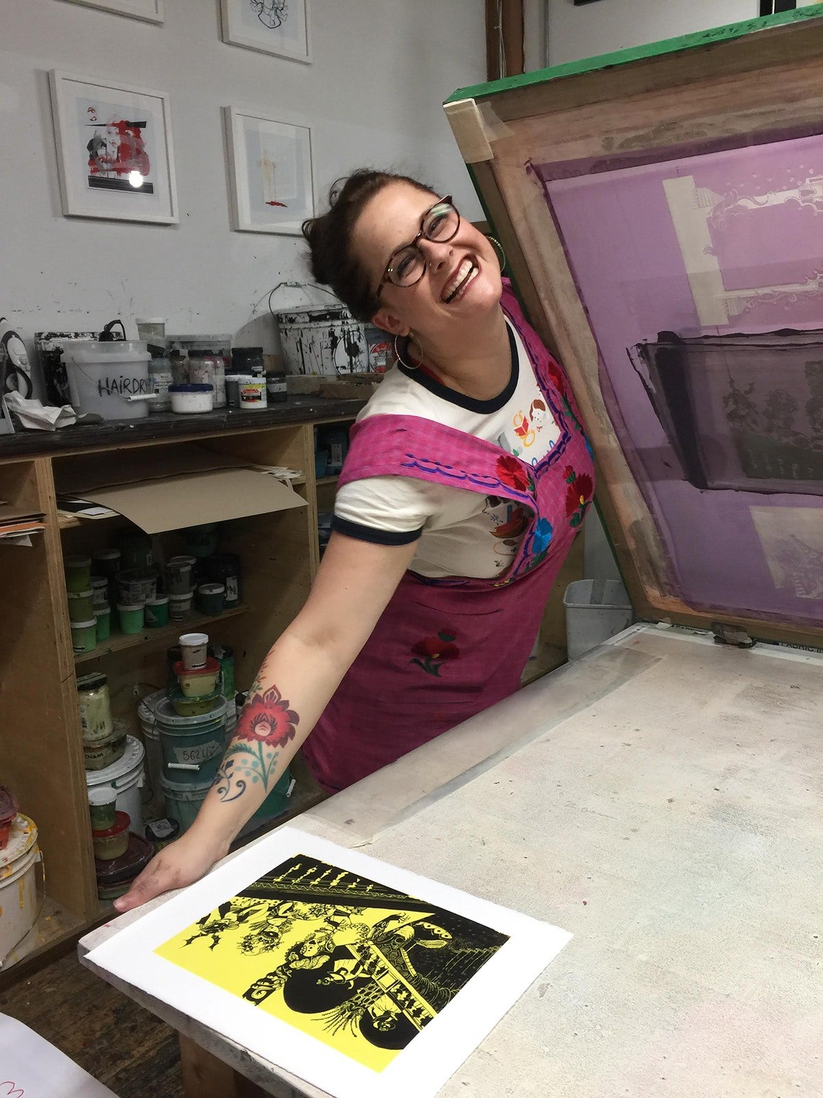
My next thought was to hand-ink three separate layers of colour on true grain (the same process I use when preparing a piece for screen-printing). One page for each layer of colour. Sadly, the only printmaking facility near me is at the University of Arkansas campus and is closed to non-students, so I combined the layers digitally then roughed them up a bit. The result was decent enough (and the deadline was looming) that I felt comfortable sending these trials back to my amazing art director and editor. They approved, and I made up the rest of the set in this manner. However, despite their approval, something still wasn’t sitting well with me. This would be the very first book entirely made by my hand. I couldn't bear the idea of its being published without my having tested every possibility. And I knew, in my heart of hearts, I needed at least to try to screen-print. If I could see the piece on paper, touch the texture of ink settled into the tooth of each page, I was sure I would then be able to release this story into the wild properly. If only I didn't live in the middle-of-nowhere in Arkansas...
So, despite my wobbly mental health and my scrawny bank account, I spent half my commission and booked a ticket to Chicago. One of my dearest friends and a very talented printmaker, Junli Song, is a fellow at Spudnik Press there. When I’m healthy I love the physical practice of screen-printing. The screens have to be lifted, flipped, scrubbed and scrubbed again. It’s a wonderful ritual. When I’m sick, however, my hyper-vigilance and anxiety result in a constant bone-deep exhaustion. It was a rough week but having Junli’s guidance and support helped immensely. She and I spent too many hours together in the studio (mostly at night when no one was there) and printed out the lot. (We also sang very badly and very loudly to the musical; it seemed only proper!)
My first attempt was to combine gouache with an overlay of black linework. I painted two spreads this way but once I imported them into Photoshop, it all felt disjointed. The quality of the lines, which I had loved, was wildly incongruous against the gestural application of the gouache. The gestural layers of paint only worked on clear large shapes and were much too muddled on scenes with crowds of smaller faces.
My next thought was to hand-ink three separate layers of colour on true grain (the same process I use when preparing a piece for screen-printing). One page for each layer of colour. Sadly, the only printmaking facility near me is at the University of Arkansas campus and is closed to non-students, so I combined the layers digitally then roughed them up a bit. The result was decent enough (and the deadline was looming) that I felt comfortable sending these trials back to my amazing art director and editor. They approved, and I made up the rest of the set in this manner. However, despite their approval, something still wasn’t sitting well with me. This would be the very first book entirely made by my hand. I couldn't bear the idea of its being published without my having tested every possibility. And I knew, in my heart of hearts, I needed at least to try to screen-print. If I could see the piece on paper, touch the texture of ink settled into the tooth of each page, I was sure I would then be able to release this story into the wild properly. If only I didn't live in the middle-of-nowhere in Arkansas...
So, despite my wobbly mental health and my scrawny bank account, I spent half my commission and booked a ticket to Chicago. One of my dearest friends and a very talented printmaker, Junli Song, is a fellow at Spudnik Press there. When I’m healthy I love the physical practice of screen-printing. The screens have to be lifted, flipped, scrubbed and scrubbed again. It’s a wonderful ritual. When I’m sick, however, my hyper-vigilance and anxiety result in a constant bone-deep exhaustion. It was a rough week but having Junli’s guidance and support helped immensely. She and I spent too many hours together in the studio (mostly at night when no one was there) and printed out the lot. (We also sang very badly and very loudly to the musical; it seemed only proper!)
 By the time I flew home, I was so sick I slept on and off for two days and dealt with PEM (post-exertional malaise) over the following weeks. But, in the end, it was all worth it. Sickness or not, I made a delightfully wicked book with The Folio Society. I, a dreamer and a nobody, now have a part in the history of this wonderful story. I hope that when you read it, it brings you equal parts joy and heebie-jeebies.
This blog was written by Taylor Dolan.
By the time I flew home, I was so sick I slept on and off for two days and dealt with PEM (post-exertional malaise) over the following weeks. But, in the end, it was all worth it. Sickness or not, I made a delightfully wicked book with The Folio Society. I, a dreamer and a nobody, now have a part in the history of this wonderful story. I hope that when you read it, it brings you equal parts joy and heebie-jeebies.
This blog was written by Taylor Dolan.
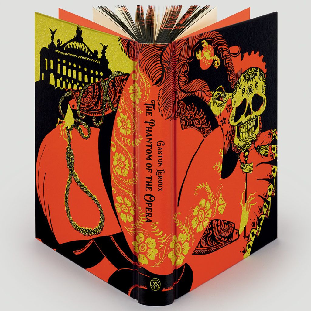 Find out more and order The Phantom of the Opera.
 Four days before Christmas 2018, an email slid into my inbox titled “Possible Commission _ FOLIO SOCIETY.” I responded twice, very nonchalant and whatnot, just in case they missed my first reply. Or in case a black hole had opened up, inverted reality and this email was meant to be sent to someone else named Taylor Dolan. In which case, they needed to know they had made a mistake.
Fortunately, for the sake of my poor heart, this was neither a cruel joke nor a black hole situation. The Folio Society wanted me to illustrate a new edition of The Phantom of the Opera. What’s more, they were asking me to revel in the grotesque language of the text written by Gaston Leroux – to highlight the grit, the darkness and the rats. As someone who has a Master’s degree in children’s book illustration, it is a rare (and wondrous) day when I am commissioned to go properly dark.
My illustrative process always begins with extensive research. In an ideal world, I would have packed my bags and taken the first flight from Arkansas to Paris. While reading the book over again and again, I had fantasies of being granted permission to draw on-site at the Palais Garnier. It is a breath-taking building, inside and out. Anything and everything would have made it into my sketchbooks: the glorious parquet flooring, the iconic trompe l’oeil curtain and the infamous seven-tonne chandelier.
Four days before Christmas 2018, an email slid into my inbox titled “Possible Commission _ FOLIO SOCIETY.” I responded twice, very nonchalant and whatnot, just in case they missed my first reply. Or in case a black hole had opened up, inverted reality and this email was meant to be sent to someone else named Taylor Dolan. In which case, they needed to know they had made a mistake.
Fortunately, for the sake of my poor heart, this was neither a cruel joke nor a black hole situation. The Folio Society wanted me to illustrate a new edition of The Phantom of the Opera. What’s more, they were asking me to revel in the grotesque language of the text written by Gaston Leroux – to highlight the grit, the darkness and the rats. As someone who has a Master’s degree in children’s book illustration, it is a rare (and wondrous) day when I am commissioned to go properly dark.
My illustrative process always begins with extensive research. In an ideal world, I would have packed my bags and taken the first flight from Arkansas to Paris. While reading the book over again and again, I had fantasies of being granted permission to draw on-site at the Palais Garnier. It is a breath-taking building, inside and out. Anything and everything would have made it into my sketchbooks: the glorious parquet flooring, the iconic trompe l’oeil curtain and the infamous seven-tonne chandelier.
 Unfortunately, while my professional life was fantastical, my personal one was not. At the same time that wonderful commission arrived, I was painfully in the middle of treatment for Post-Traumatic Stress Disorder (among other delightful mental health disorders). My PTSD manifested itself in such a way that, although I dreamt of France, I was unable to leave my own house for more than 30 minutes without a panic attack. So, since Paris was out of the question, I had to put in some serious hours of imagination fabrication in order to pull off this story. Somehow, I knew I would have to find a way to create the texture of Paris in the late 1800s, all while living my life as a depressed puddle in a state few Americans can find on a map.
Building up the visual language for a story is like tending to a living organism. It needs to be fed with all sorts in order for an illustration to flower: a diet consisting of books, music, colours, patterns and art-historical references, among other things. All of which I sketch until I find the right touch for the story I’m working on.
As I began to blend ideas and collect shapes, I settled on a few different influences to serve as my personal parameters:
Unfortunately, while my professional life was fantastical, my personal one was not. At the same time that wonderful commission arrived, I was painfully in the middle of treatment for Post-Traumatic Stress Disorder (among other delightful mental health disorders). My PTSD manifested itself in such a way that, although I dreamt of France, I was unable to leave my own house for more than 30 minutes without a panic attack. So, since Paris was out of the question, I had to put in some serious hours of imagination fabrication in order to pull off this story. Somehow, I knew I would have to find a way to create the texture of Paris in the late 1800s, all while living my life as a depressed puddle in a state few Americans can find on a map.
Building up the visual language for a story is like tending to a living organism. It needs to be fed with all sorts in order for an illustration to flower: a diet consisting of books, music, colours, patterns and art-historical references, among other things. All of which I sketch until I find the right touch for the story I’m working on.
As I began to blend ideas and collect shapes, I settled on a few different influences to serve as my personal parameters:
- Jojo Gomez’s choreography to the song ‘bury a friend’ by Billie Eilish. It’s all serpentine movements cut short by incongruous body shapes – delightfully fiendish
- El Museo de las Momias (‘The Museum of the Mummies’) in Guanajuato, Mexico
- The heavenly embroidery in Dolce & Gabbana’s 2012 Fall Menswear collection
- The Monstrorum Historia by Ulisse Aldrovandi (written and illustrated in the late 1500s)
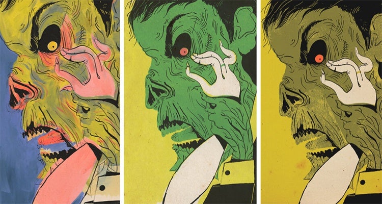
Case Study: full-colour illustration #4
Step One: choosing the scene
‘I rolled up into a ball at his feet but he grabbed both my hands, Raoul...and dug them into the horror that was his face...and raked his flesh with my nails, his loathsome dead flesh!’ How could I not illustrate something so vivid and ghastly?Step Two: research
At this point, I knew I wanted to draw the scene where Erik rips off his mask and forces Christine to look at him. A volatile combination for high drama. I spent most of my time studying dance duets that dealt with power imbalances. After compiling sheets of disturbingly drawn bodies, I began to notice the images that really struck me were the ones with gaping mouths and outthrust tongues. A tongue can be a truly obscene thing when investigated too closely.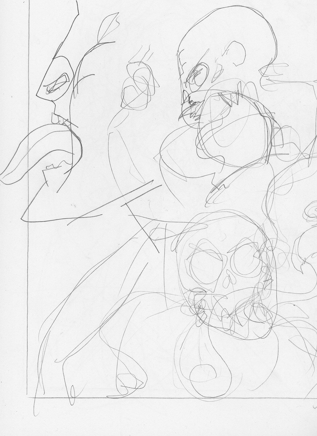
Step Three: thumbnails
This scene is told from Christine’s perspective, as she is sharing her nightmarish memories with Raoul, so it made sense to shift the compositional perspective. Instead of showing two full-body figures entangled, I pushed the illustration to close in on a very tight shot of Erik’s face. The absence of Christine’s face forces the reader to feel as if her grasping hand could be their hand.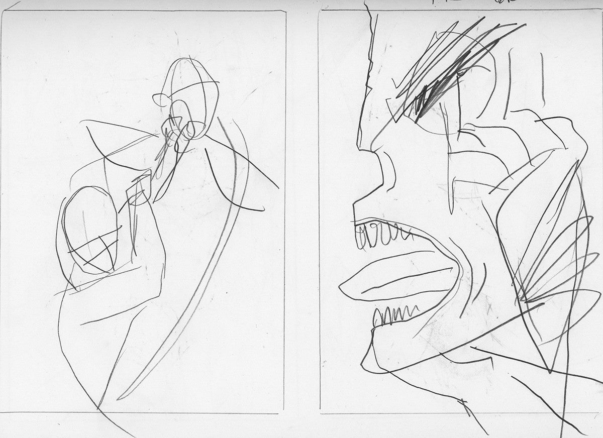
Step Four: medium
I had the feeling, the composition and the pencilling all down and sorted. I knew what sort of colour palettes I liked and which ones irked me. I was fairly certain I wanted to keep each spread to a limited number of colours. I could not, however, visualise what medium I would use to add colour. My happy place has always been dip-pen and black ink. I needed to find a way to add colour without making the whole thing look like a glorified colouring book.
My first attempt was to combine gouache with an overlay of black linework. I painted two spreads this way but once I imported them into Photoshop, it all felt disjointed. The quality of the lines, which I had loved, was wildly incongruous against the gestural application of the gouache. The gestural layers of paint only worked on clear large shapes and were much too muddled on scenes with crowds of smaller faces.
My next thought was to hand-ink three separate layers of colour on true grain (the same process I use when preparing a piece for screen-printing). One page for each layer of colour. Sadly, the only printmaking facility near me is at the University of Arkansas campus and is closed to non-students, so I combined the layers digitally then roughed them up a bit. The result was decent enough (and the deadline was looming) that I felt comfortable sending these trials back to my amazing art director and editor. They approved, and I made up the rest of the set in this manner. However, despite their approval, something still wasn’t sitting well with me. This would be the very first book entirely made by my hand. I couldn't bear the idea of its being published without my having tested every possibility. And I knew, in my heart of hearts, I needed at least to try to screen-print. If I could see the piece on paper, touch the texture of ink settled into the tooth of each page, I was sure I would then be able to release this story into the wild properly. If only I didn't live in the middle-of-nowhere in Arkansas...
So, despite my wobbly mental health and my scrawny bank account, I spent half my commission and booked a ticket to Chicago. One of my dearest friends and a very talented printmaker, Junli Song, is a fellow at Spudnik Press there. When I’m healthy I love the physical practice of screen-printing. The screens have to be lifted, flipped, scrubbed and scrubbed again. It’s a wonderful ritual. When I’m sick, however, my hyper-vigilance and anxiety result in a constant bone-deep exhaustion. It was a rough week but having Junli’s guidance and support helped immensely. She and I spent too many hours together in the studio (mostly at night when no one was there) and printed out the lot. (We also sang very badly and very loudly to the musical; it seemed only proper!)
 By the time I flew home, I was so sick I slept on and off for two days and dealt with PEM (post-exertional malaise) over the following weeks. But, in the end, it was all worth it. Sickness or not, I made a delightfully wicked book with The Folio Society. I, a dreamer and a nobody, now have a part in the history of this wonderful story. I hope that when you read it, it brings you equal parts joy and heebie-jeebies.
This blog was written by Taylor Dolan.
Find out more and order The Phantom of the Opera.
By the time I flew home, I was so sick I slept on and off for two days and dealt with PEM (post-exertional malaise) over the following weeks. But, in the end, it was all worth it. Sickness or not, I made a delightfully wicked book with The Folio Society. I, a dreamer and a nobody, now have a part in the history of this wonderful story. I hope that when you read it, it brings you equal parts joy and heebie-jeebies.
This blog was written by Taylor Dolan.
Find out more and order The Phantom of the Opera.